ReWA: A Visual Strategy to Promote Family & Community Empowerement
ReWA: A Visual Strategy to Promote Family & Community Empowerement
Overview
Overview
Rebranded Refugee Women’s Alliance (ReWA) to modernize their visual identity and make it more cohesive and emotionally resonant. The new brand improved clarity and trust, making it easier for refugee and immigrant families to find services—especially on mobile. The redesign boosted online engagement by an estimated 30% and strengthened ReWA’s credibility with the community.
Rebranded Refugee Women’s Alliance (ReWA) to modernize their visual identity and make it more cohesive and emotionally resonant. The new brand improved clarity and trust, making it easier for refugee and immigrant families to find services—especially on mobile. The redesign boosted online engagement by an estimated 30% and strengthened ReWA’s credibility with the community.
My Role
My Role
As the sole designer, I led this 10-week rebrand from research through execution, bridging visual design, UX strategy, and brand systems thinking. I conducted a full brand audit and stakeholder research to uncover gaps in trust and usability. I designed a new logo using Gestalt principles to symbolize transformation and support, created a cohesive icon set, and redesigned mobile screens to simplify navigation and boost community action. To ensure long-term consistency, I built a detailed brand book with clear guidelines for staff and partners. My work empowered ReWA to communicate their mission clearly and build trust across all platforms.
As the sole designer, I led this 10-week rebrand from research through execution, bridging visual design, UX strategy, and brand systems thinking. I conducted a full brand audit and stakeholder research to uncover gaps in trust and usability. I designed a new logo using Gestalt principles to symbolize transformation and support, created a cohesive icon set, and redesigned mobile screens to simplify navigation and boost community action. To ensure long-term consistency, I built a detailed brand book with clear guidelines for staff and partners. My work empowered ReWA to communicate their mission clearly and build trust across all platforms.
Project Type
Project Type
Branding, Visual Design, Responsive UI
Team
Team
Solo project, self-led
Timeline
Timeline
10 weeks
10 weeks
Tools
Tools
Tools
Figma, Adobe Illustrator & Photoshop
Figma, Adobe Illustrator & Photoshop
Figma, Adobe Illustrator & Photoshop
Client
Client
Non-Profit
Non-Profit
Branding, Visual Design, Responsive UI
Solo project, self-led
Impact
Impact
unified across three digital channels
unified across three digital channels
3 custom icons
3 custom icons
3 custom icons
for long-term growth
for long-term growth
Scalable brand system
Scalable brand system
Scalable brand system
Increased brand clarity & cohesion
improving usability and discoverability
improving usability and discoverability
Increased brand clarity & cohesion
Increased brand clarity & cohesion
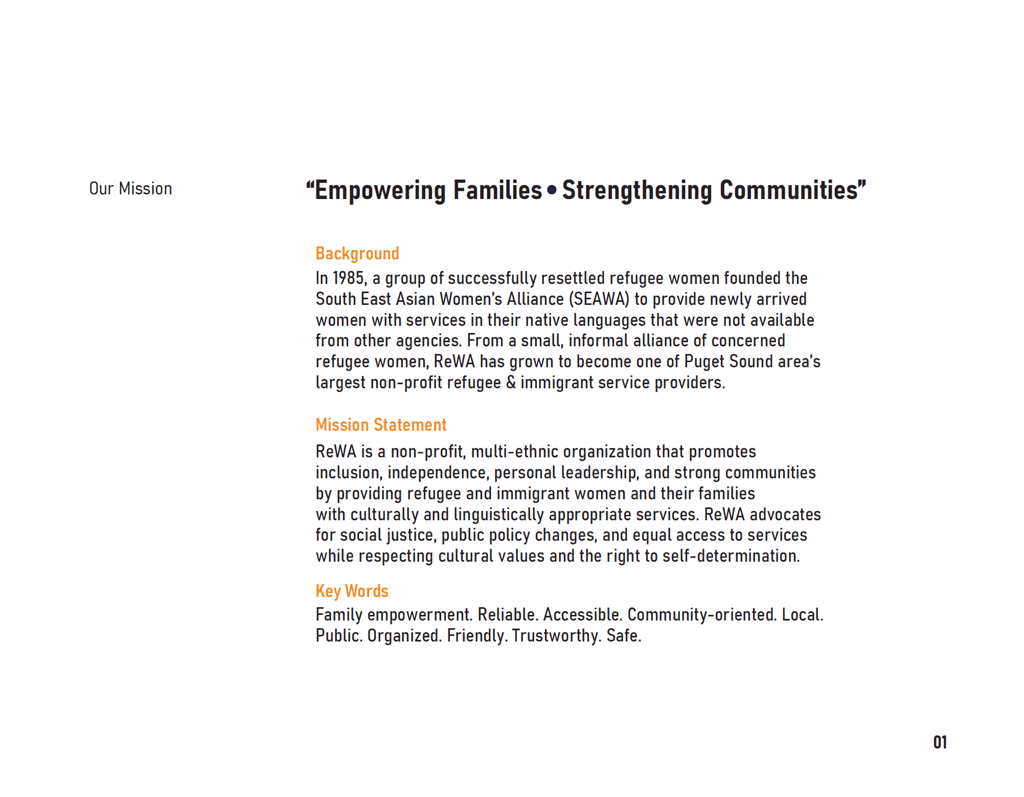
Outdated Branding Undermined a Powerful Mission
Outdated Branding Undermined a Powerful Mission
Outdated Branding Undermined a Powerful Mission
ReWA’s identity lacked cohesion, mobile adaptability, and emotional resonance. The logo was symbolic but visually outdated. Users struggled to find key services, especially on mobile, affecting engagement and accessibility.
ReWA’s identity lacked cohesion, mobile adaptability, and emotional resonance. The logo was symbolic but visually outdated. Users struggled to find key services, especially on mobile, affecting engagement and accessibility.
I began with a deep dive into ReWA’s history, mission, and community impact. I audited the existing brand, identifying inconsistencies in logo application, color usage, and user trust indicators. Key insights:
Users associated ReWA with transformation and care
Visual inconsistences reduced trust
Through informal feedback from users and visual analysis, I surfaced key opportunities for design to amplify ReWA’s core message of empowerment, family, and transformation.
I began with a deep dive into ReWA’s history, mission, and community impact. I audited the existing brand, identifying inconsistencies in logo application, color usage, and user trust indicators.
Key insights:
- Users associated ReWA with transformation and care
- Visual inconsistences reduced trust
Through informal feedback from users and visual analysis, I surfaced key opportunities for design to amplify ReWA’s core message of empowerment, family, and transformation.
I began with a deep dive into ReWA’s history, mission, and community impact. I audited the existing brand, identifying inconsistencies in logo application, color usage, and user trust indicators.
Key insights:
-Users associated ReWA with transformation and care
-Visual inconsistences reduced trust
Through informal feedback from users and visual analysis, I surfaced key opportunities for design to amplify ReWA’s core message of empowerment, family, and transformation.
Identified branding gaps that weakened ReWA’s impact across digital & emotional touchpoints
Identified branding gaps that weakened ReWA’s impact across digital & emotional touchpoints
Identified branding gaps that weakened ReWA’s impact across digital & emotional touchpoints
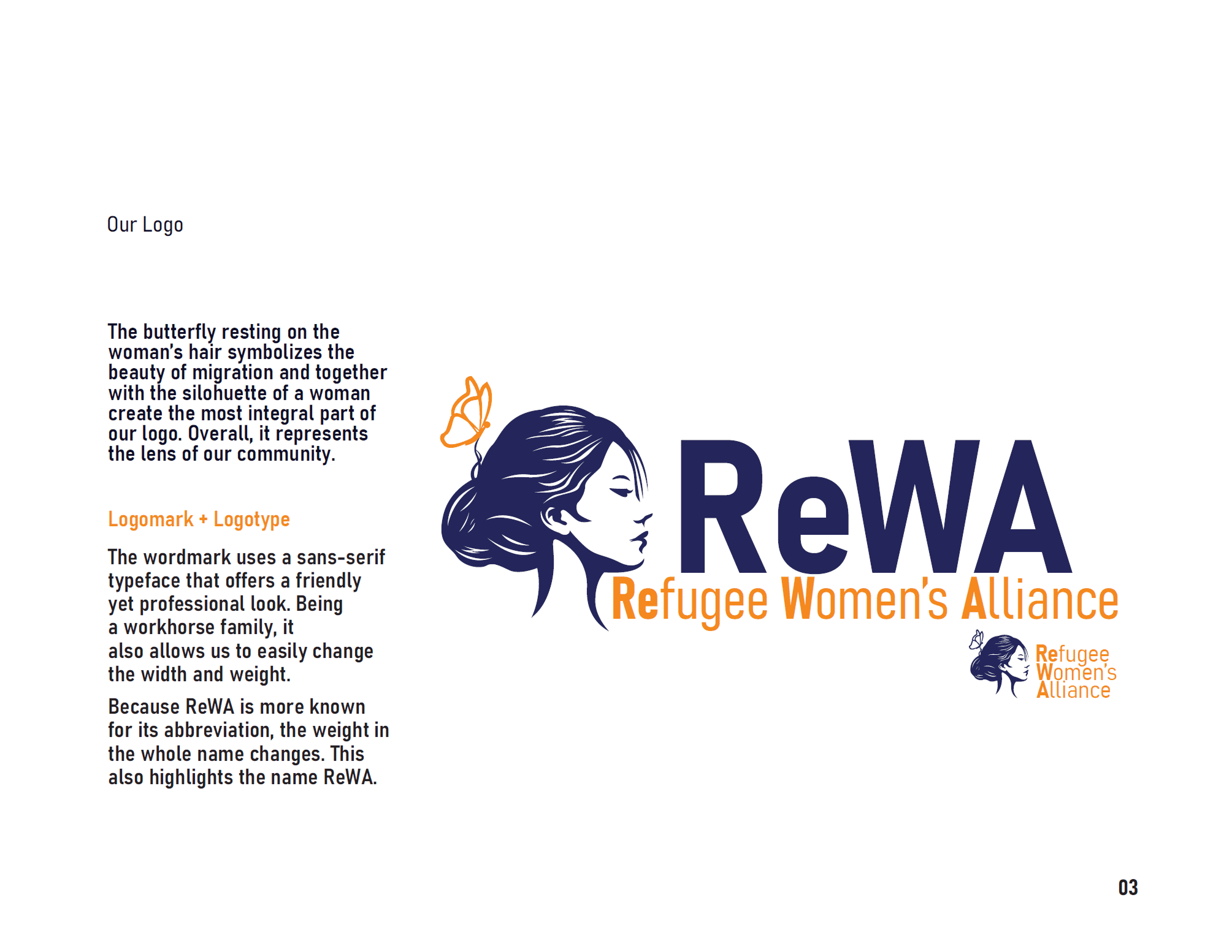
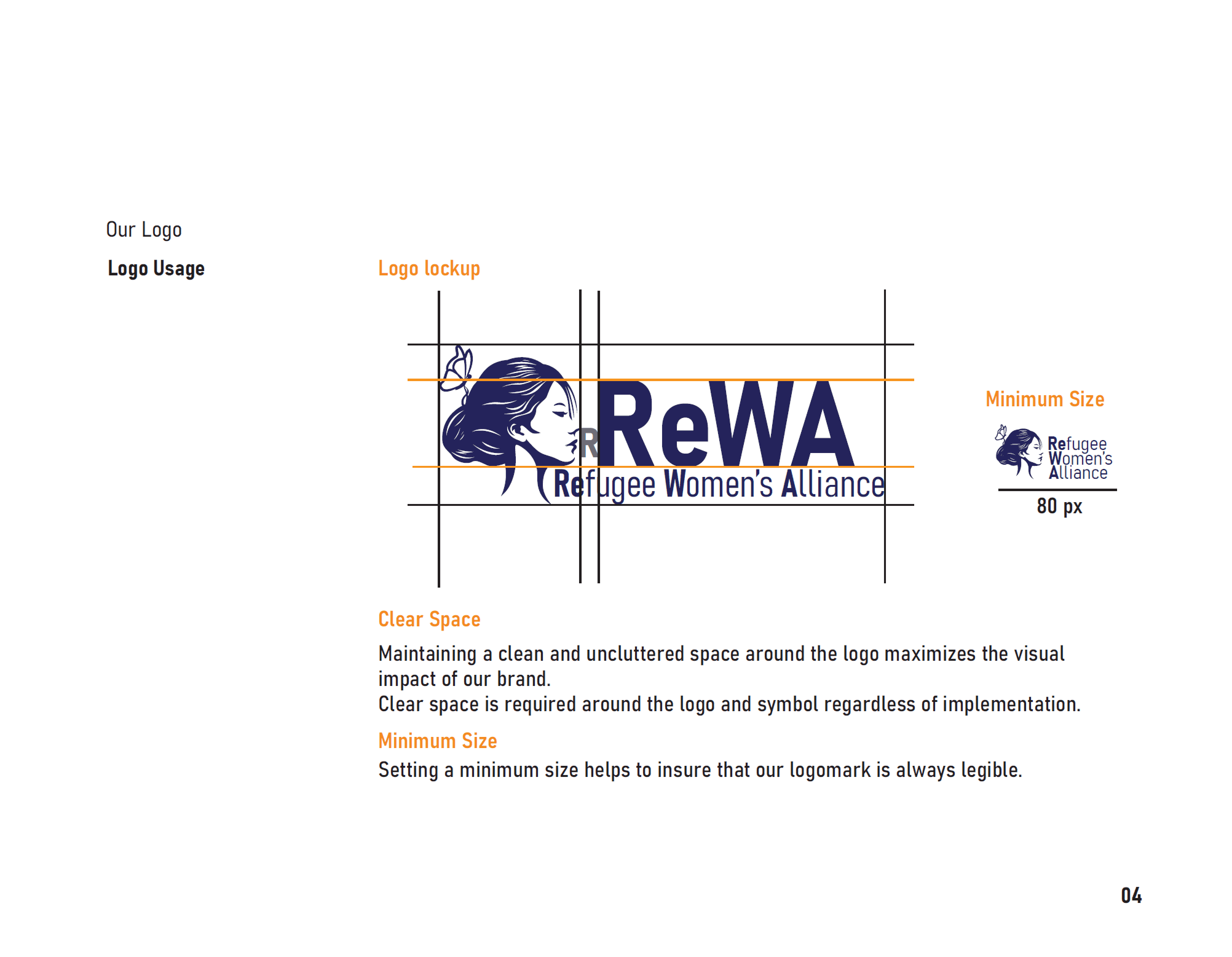
Brand Research Revealed the need for symbolic and Functional Alignment
Brand Research Revealed the need for symbolic and Functional Alignment
Brand Research Revealed the need for symbolic and Functional Alignment
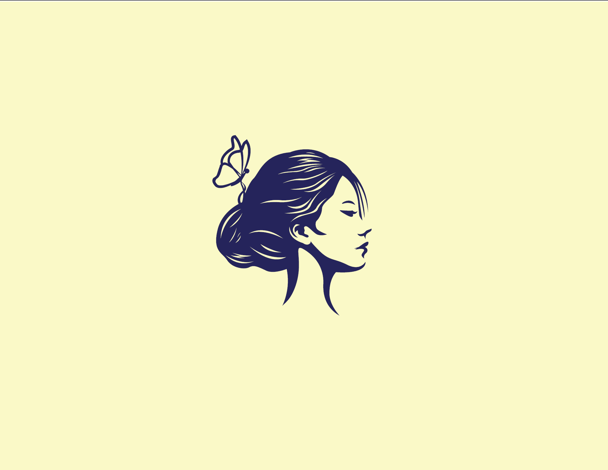
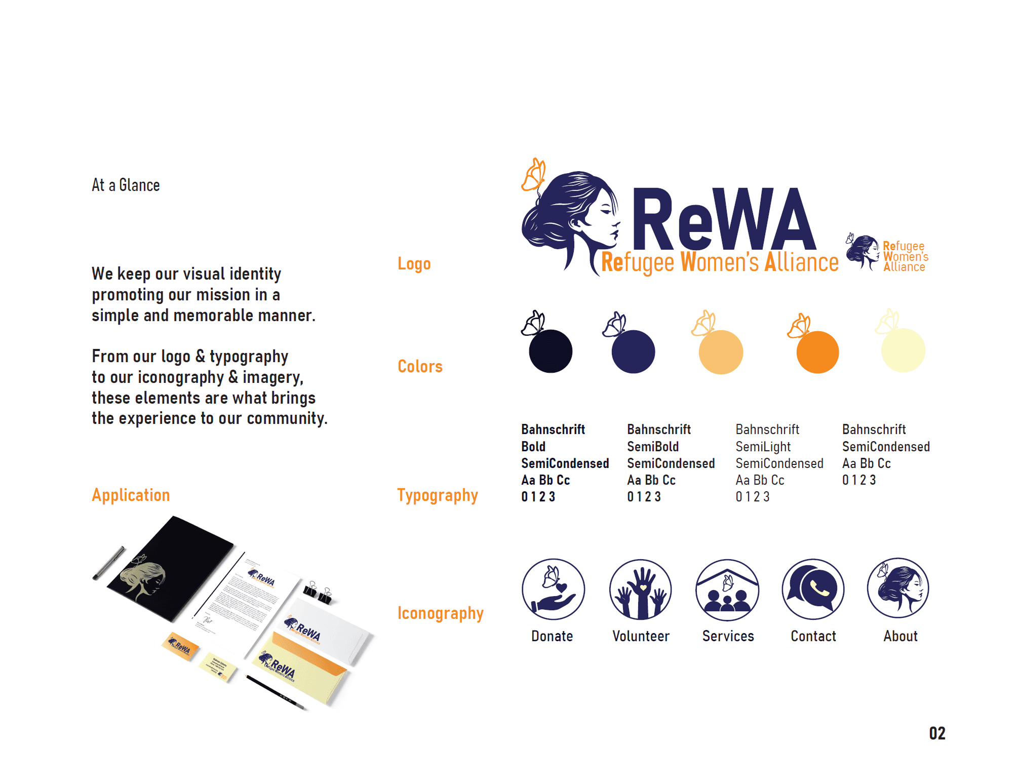
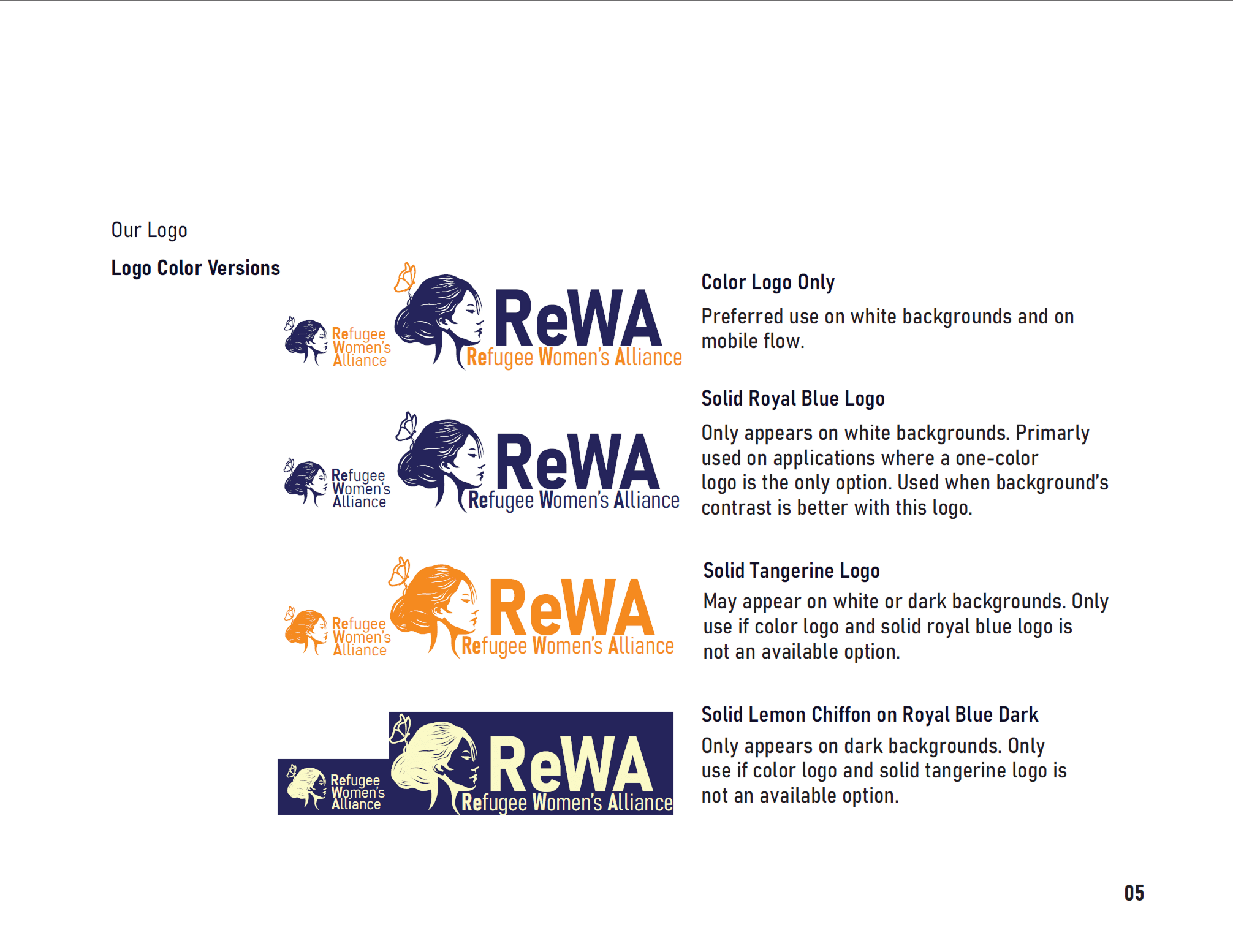
Using Gestalt principles, I designed a logo that combines a butterfly and a woman’s silhouette—symbolizing migration, growth, and support. The clean wordmark balances warmth and professionalism, ensuring adaptability across formats while highlighting the abbreviation "ReWA."
Using Gestalt principles, I designed a logo that combines a butterfly and a woman’s silhouette—symbolizing migration, growth, and support. The clean wordmark balances warmth and professionalism, ensuring adaptability across formats while highlighting the abbreviation "ReWA."
Designing a logo that symbolizes transformation, resilience, & community visually
Designing a logo that symbolizes transformation, resilience, & community visually
Designing a logo that symbolizes transformation, resilience, & community visually
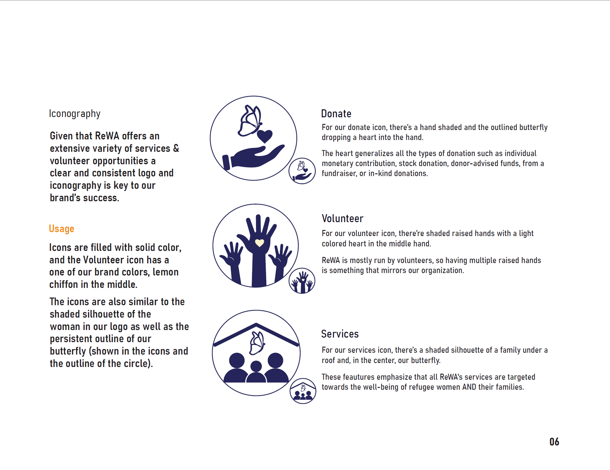
Designed mission-aligned icons to reinforce brand values and simplify user navigation
Designed mission-aligned icons to reinforce brand values and simplify user navigation
Designed mission-aligned icons to reinforce brand values and simplify user navigation
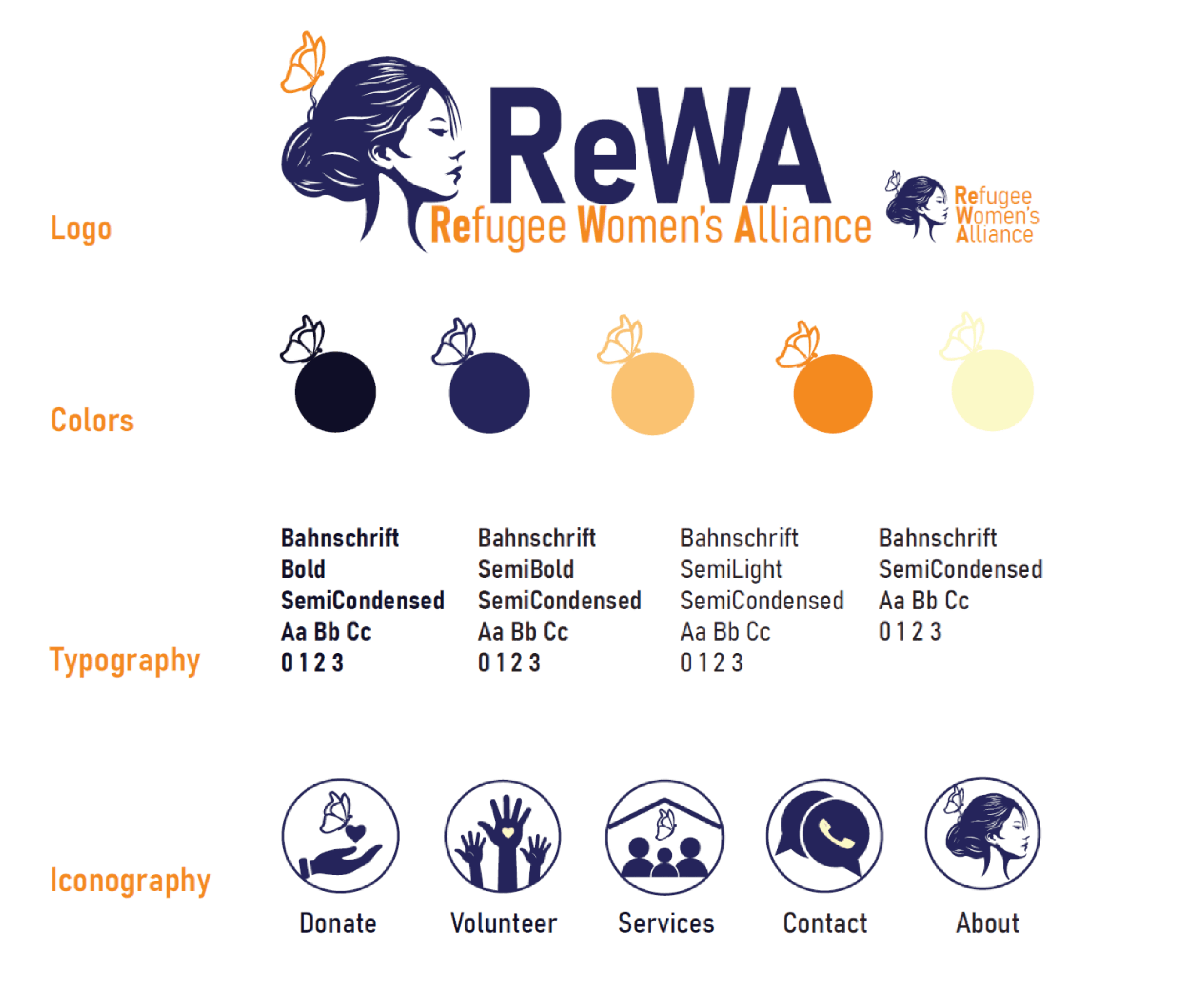
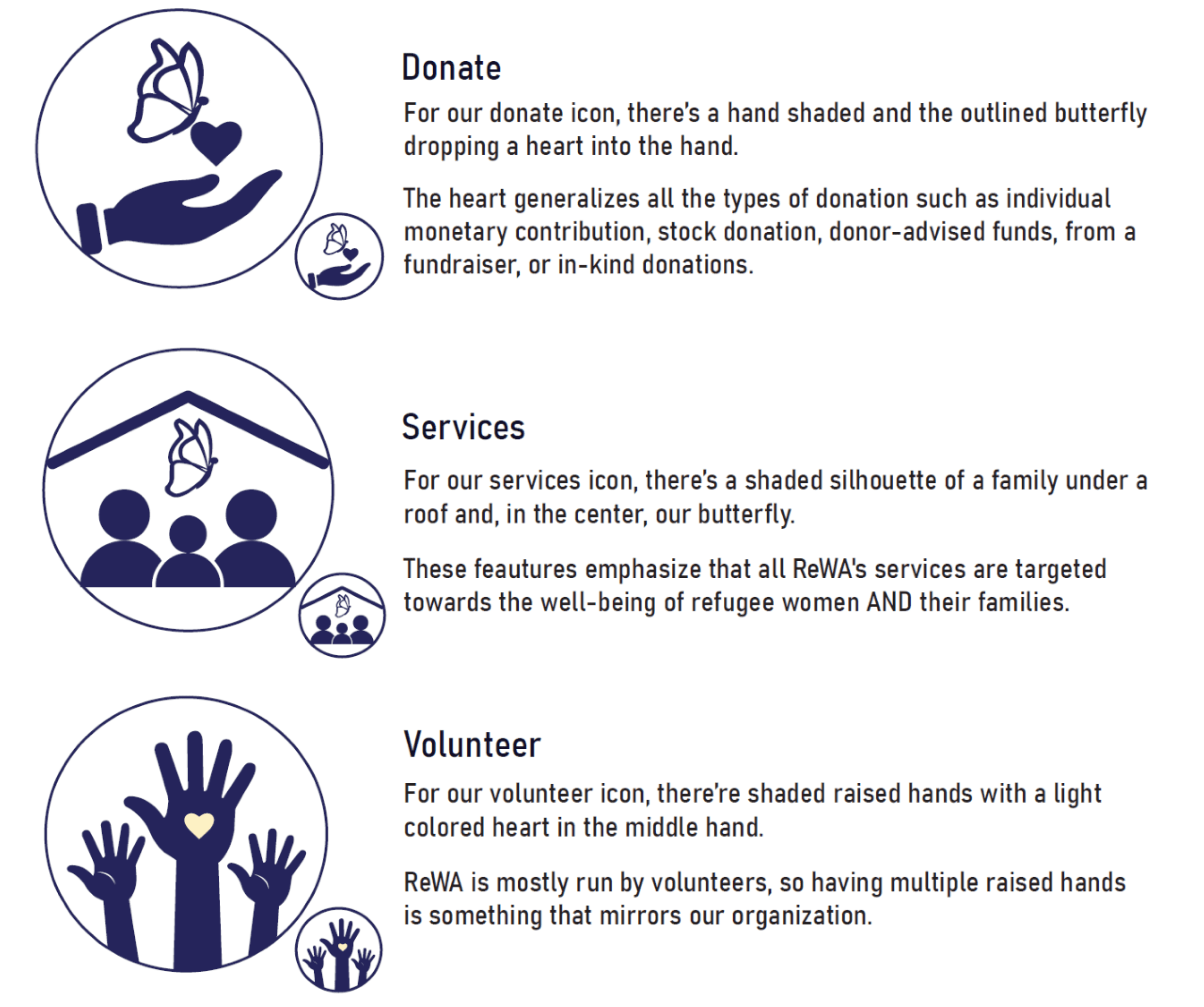
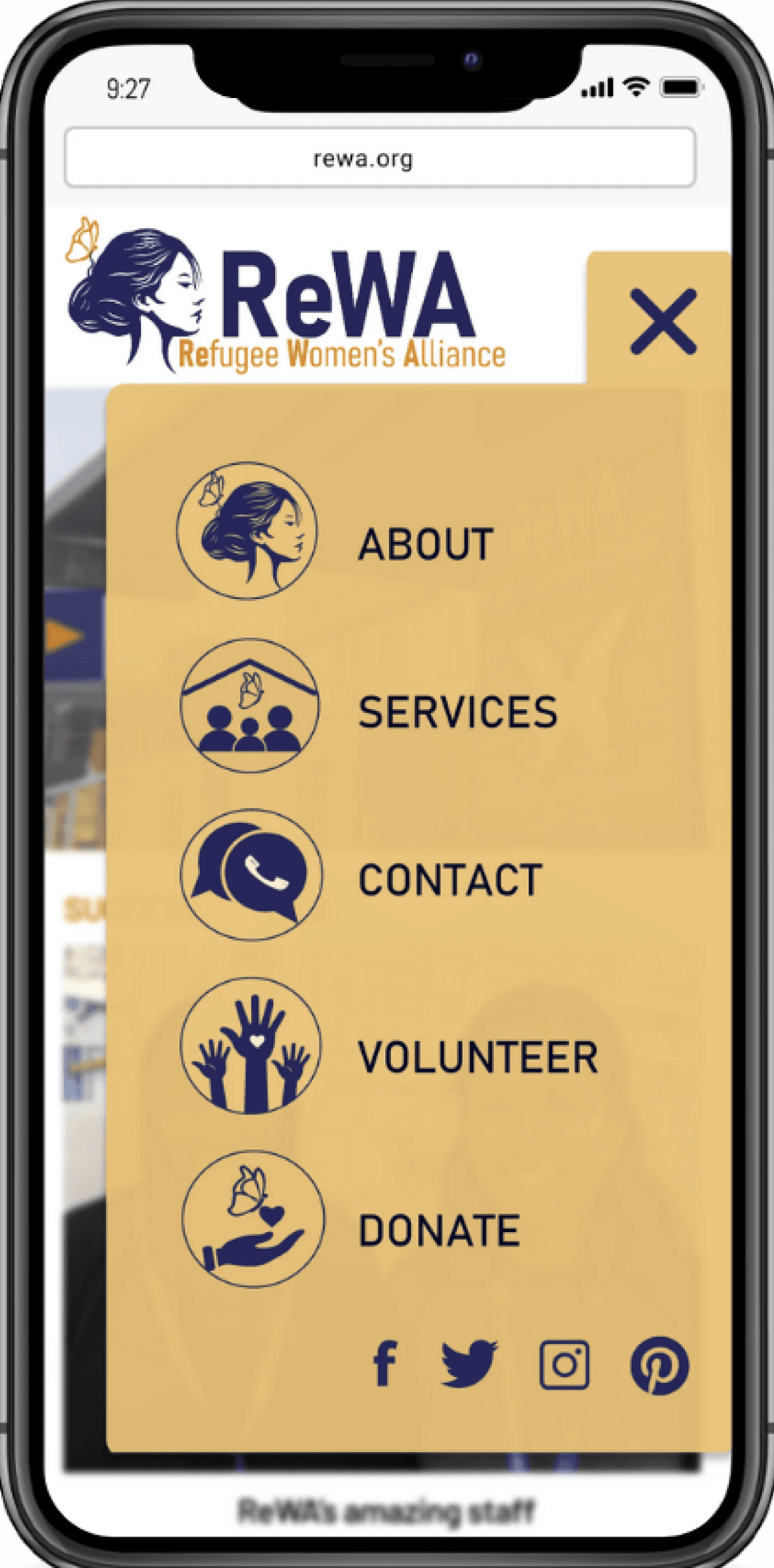
Each custom icon blends the butterfly motif with human elements to reinforce ReWA’s values and improve interface navigation. Icons for Donate, Volunteer, and Services mirror the central logo's visual elements to maintain cohesion and enhance usability.
Each custom icon blends the butterfly motif with human elements to reinforce ReWA’s values and improve interface navigation. Icons for Donate, Volunteer, and Services mirror the central logo's visual elements to maintain cohesion and enhance usability.
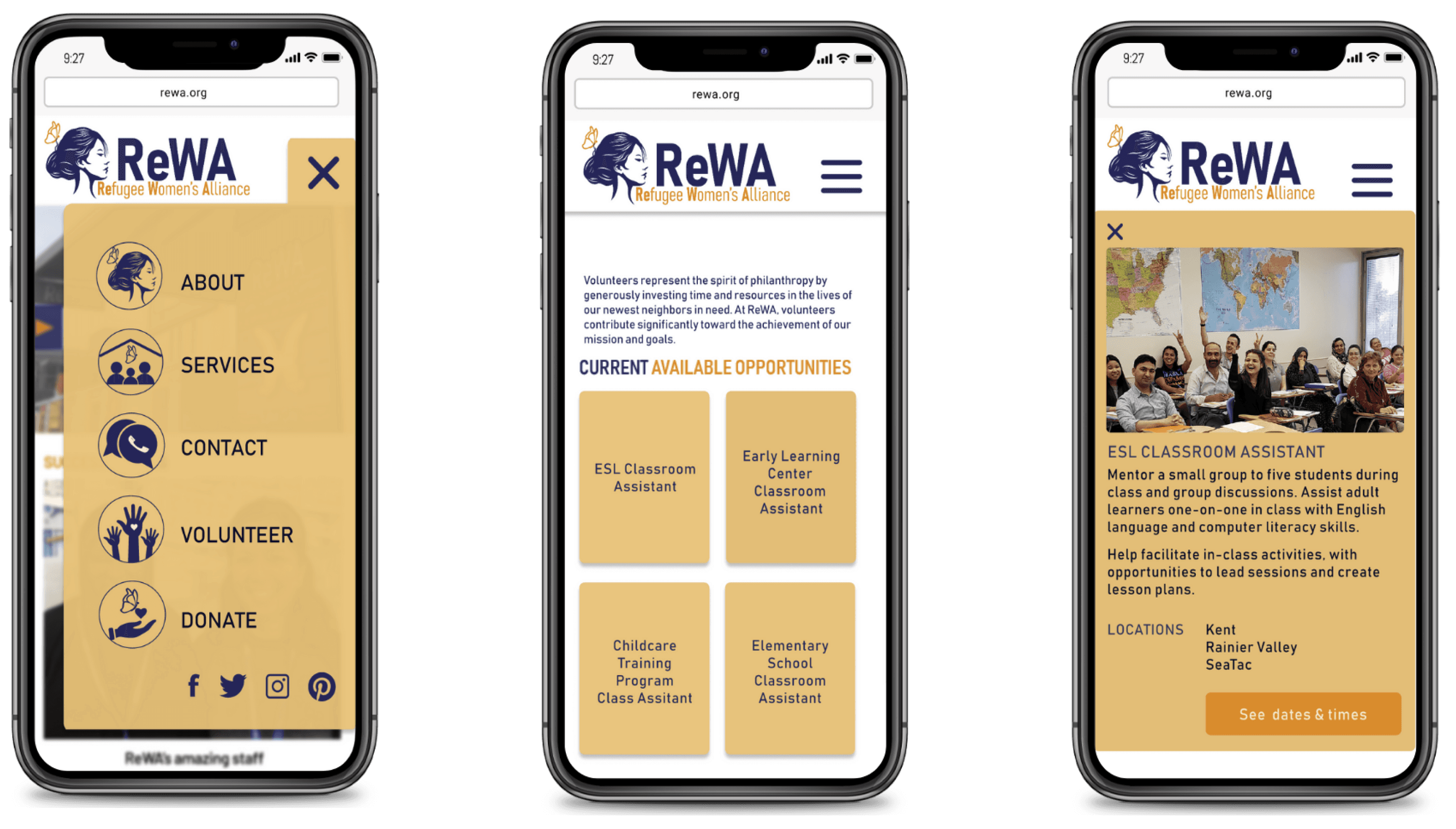
The redesign of the mobile interface aimed to simplify the process of finding and engaging with volunteer opportunities.
The redesign of the mobile interface aimed to simplify the process of finding and engaging with volunteer opportunities.
Strategy: I introduced intuitive navigation and micro-interactions, such as simplified menus and informative dropdowns, ensuring that users can access information swiftly and effortlessly.
Strategy: I introduced intuitive navigation and micro-interactions, such as simplified menus and informative dropdowns, ensuring that users can access information swiftly and effortlessly.
Improved mobile UX by restructuring information and introducing accessible interactions
Improved mobile UX by restructuring information and introducing accessible interactions
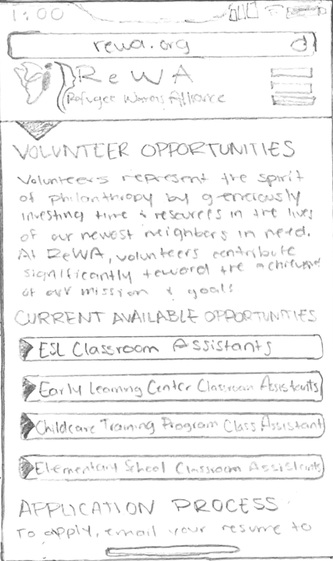
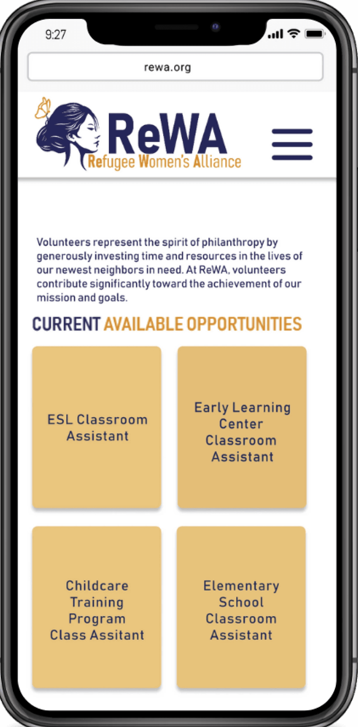
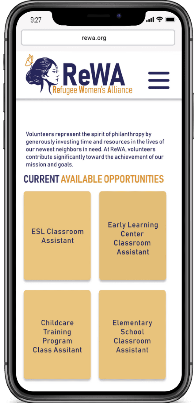
Micro-interaction: After the first block of text where the mission is stated, the Current Available Opportunities will have tabs of all the opportunities with a drop down menu for more info.
Pain Point: User lacks absolute interaction as the page is just a bunch of text.
Micro-interaction: The arrow for the drop down info points down instead of to the side.
User can continue to scroll down and see the Application Process and the block of text with more information
Button: It walks the user through the application process. NOTE: To apply, the user only needs to send a resume
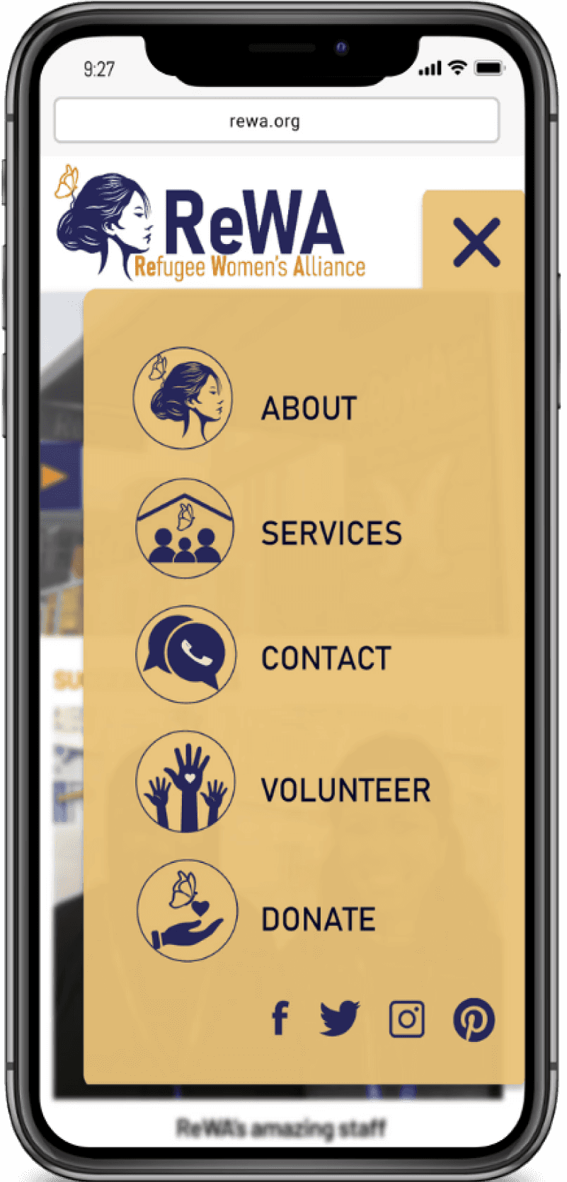
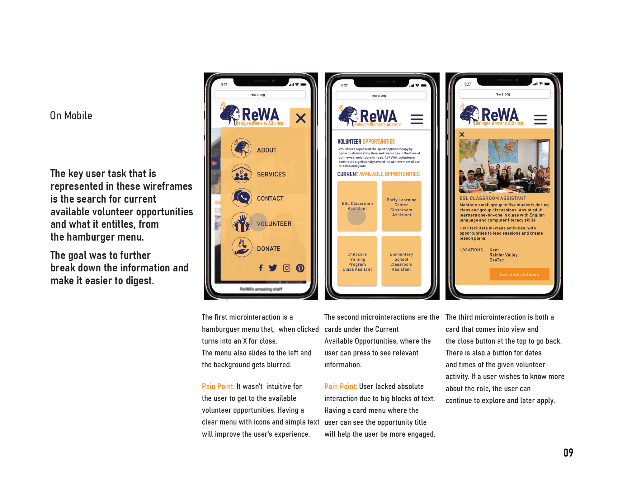
The first micro-interaction is a hamburger menu that, when clicked turns into an X for close. The menu also slides to the left and the background gets blurred.
Pain Point: It wasn’t intuitive for the user to get to the available volunteer opportunities. Having a clear menu with icons and simple text will improve the user‘s experience.
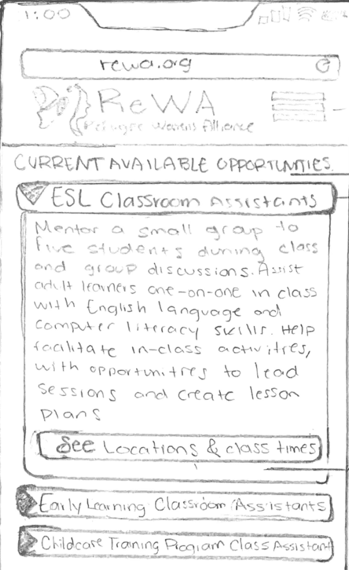
The second micro-interactions are the cards under the Current Available Opportunities, where the user can press to see relevant information.
Pain Point: User lacked absolute interaction due to big blocks of text. Having a card menu where the
user can see the opportunity title will help the user be more engaged.
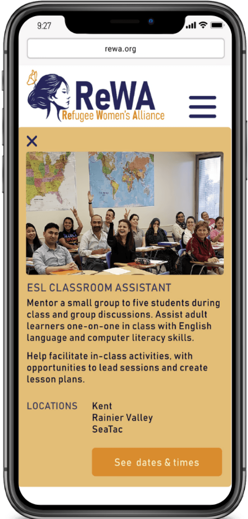
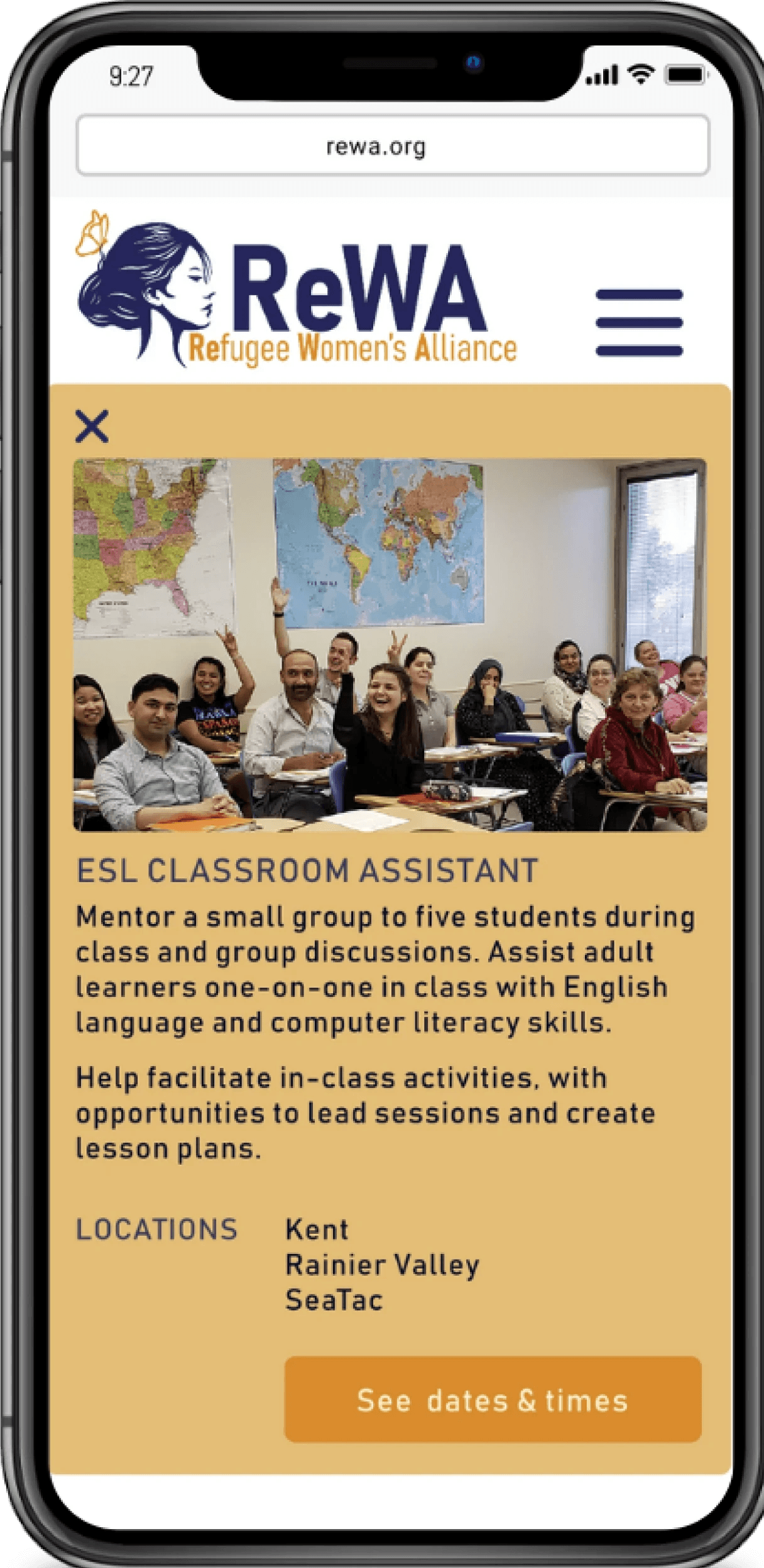
The third micro-interaction is both a card that comes into view and the close button at the top to go back.
There is also a button for dates and times of the given volunteer activity. If a user wishes to know more about the role, the user can continue to explore and later apply.
Pain Point: User lacks absolute interaction as the page is just a bunch of text.
Micro-interaction: After the first block of text where the mission is stated, the Current Available Opportunities will have tabs of all the opportunities with a drop down menu for more info.
Micro-interaction: The arrow for the drop down info points down instead of to the side.
Button: It walks the user through the application process. NOTE: To apply, the user only needs to send a resume
User can continue to scroll down and see the Application Process and the block of text with more information
The first micro-interaction is a hamburger menu that, when clicked turns into an X for close. The menu also slides to the left and the background gets blurred.
Pain Point: It wasn’t intuitive for the user to get to the available volunteer opportunities. Having a clear menu with icons and simple text will improve the user‘s experience.
The second micro-interactions are the cards under the Current Available Opportunities, where the user can press to see relevant information.
Pain Point: User lacked absolute interaction due to big blocks of text. Having a card menu where the
user can see the opportunity title will help the user be more engaged.
The third micro-interaction is both a card that comes into view and the close button at the top to go back.
There is also a button for dates and times of the given volunteer activity. If a user wishes to know more about the role, the user can continue to explore and later apply.
Pain Point: User lacks absolute interaction as the page is just a bunch of text.
Micro-interaction: After the first block of text where the mission is stated, the Current Available Opportunities will have tabs of all the opportunities with a drop down menu for more info.
Button: It walks the user through the application process. NOTE: To apply, the user only needs to send a resume
Micro-interaction: The arrow for the drop down info points down instead of to the side.
User can continue to scroll down and see the Application Process and the block of text with more information
The first micro-interaction is a hamburger menu that, when clicked turns into an X for close. The menu also slides to the left and the background gets blurred.
Pain Point: It wasn’t intuitive for the user to get to the available volunteer opportunities. Having a clear menu with icons and simple text will improve the user‘s experience.
The second micro-interactions are the cards under the Current Available Opportunities, where the user can press to see relevant information.
Pain Point: User lacked absolute interaction due to big blocks of text. Having a card menu where the
user can see the opportunity title will help the user be more engaged.
The third micro-interaction is both a card that comes into view and the close button at the top to go back.
There is also a button for dates and times of the given volunteer activity. If a user wishes to know more about the role, the user can continue to explore and later apply.
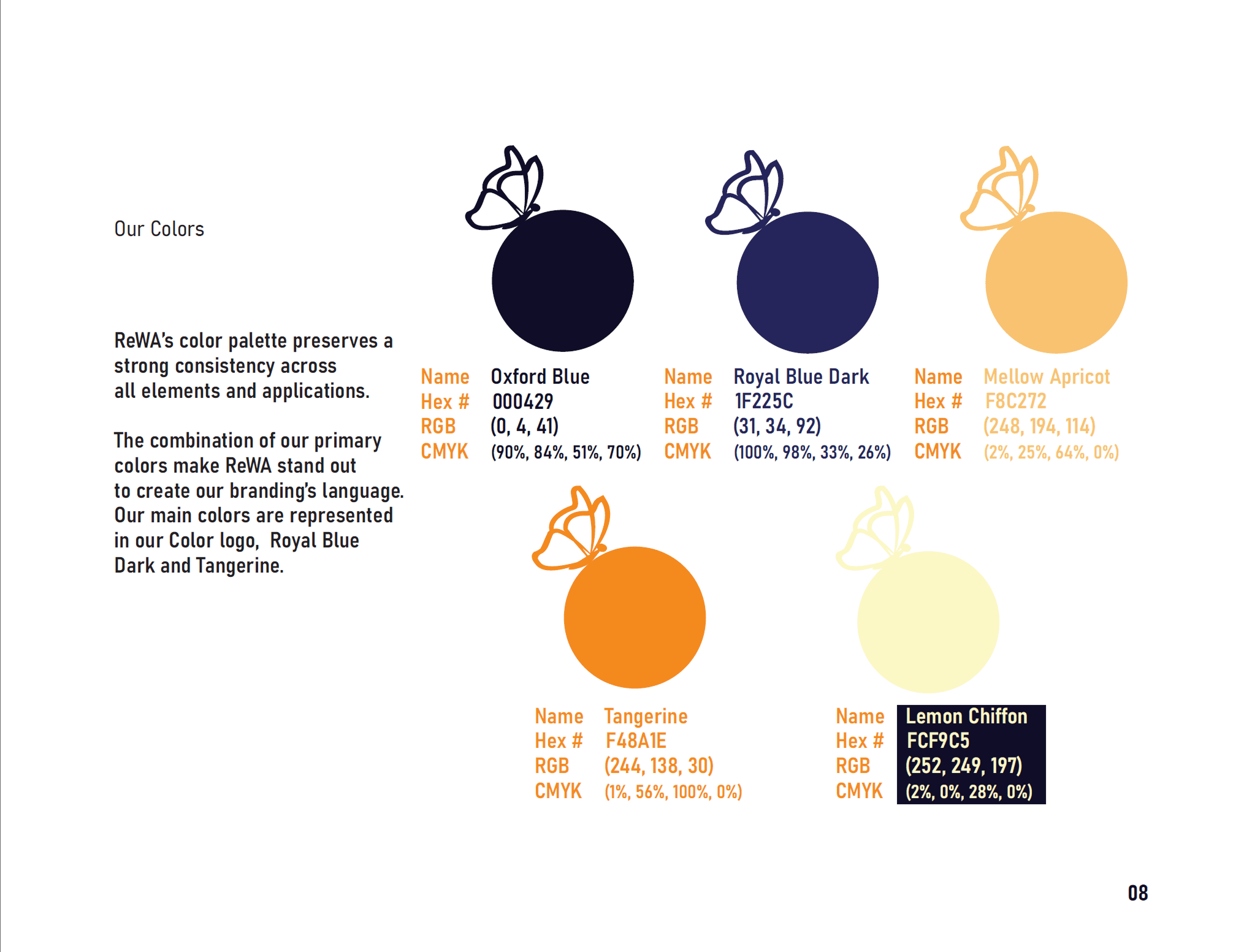
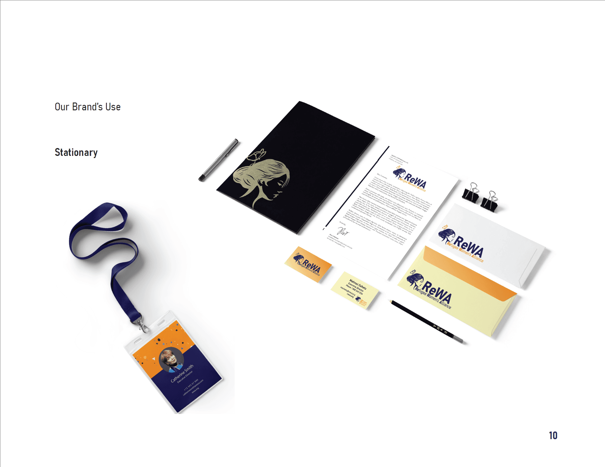
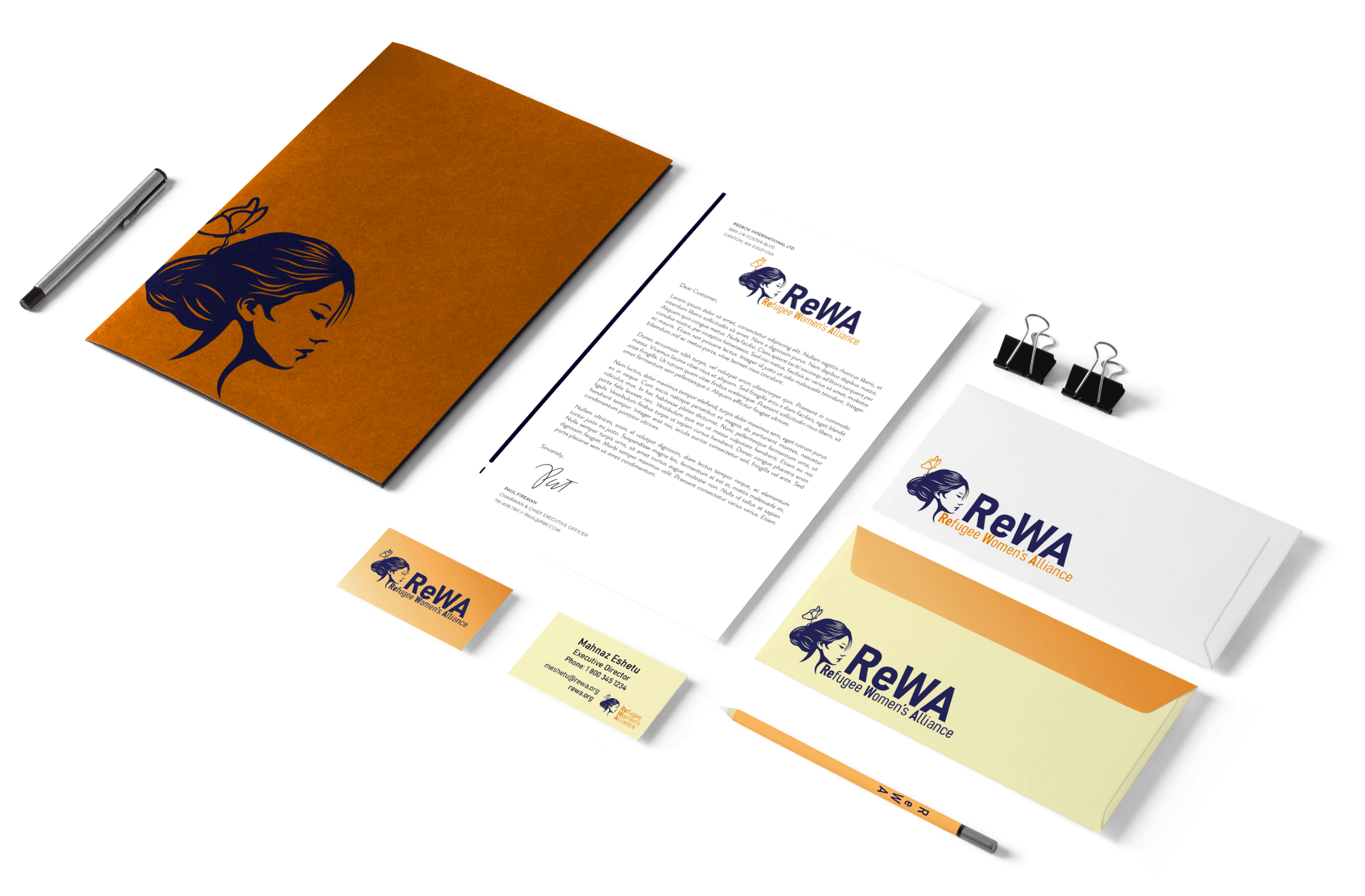
To ensure brand consistency and scalability, I developed a comprehensive brand book. It outlines best practices for logo usage, color palettes, typography, iconography, and accessibility. This document empowers ReWA staff to maintain a unified identity across all platforms.
To ensure brand consistency and scalability, I developed a comprehensive brand book. It outlines best practices for logo usage, color palettes, typography, iconography, and accessibility. This document empowers ReWA staff to maintain a unified identity across all platforms.
Built a scalable brand book to ensure consistent implementation across platforms and teams
Built a scalable brand book to ensure consistent implementation across platforms and teams
Built a scalable brand book to ensure consistent implementation across platforms and teams
The redesign unified ReWA’s branding across touchpoints and improved clarity and usability, enhancing community awareness and reinforcing ReWA's credibility and mission-driven services.
The redesign unified ReWA’s branding across touchpoints and improved clarity and usability, enhancing community awareness and reinforcing ReWA's credibility and mission-driven services.
This project has highlighted the transformative power of design in the non-profit sector, showing how strategic visual communication can profoundly influence community engagement and organizational growth.
This project has highlighted the transformative power of design in the non-profit sector, showing how strategic visual communication can profoundly influence community engagement and organizational growth.
Delivered a revitalized brand that increased community engagement and organizational visibility
Delivered a revitalized brand that increased community engagement and organizational visibility
Delivered a revitalized brand that increased community engagement and organizational visibility
Reflection & Learnings
Reflection & Learnings
This project honed my ability to lead brand strategy and execute emotionally resonant, scalable design systems. I grew more confident in stakeholder alignment, visual storytelling, and creating accessible interfaces. Future iterations would include direct user interviews to deepen emotional validation.
This project honed my ability to lead brand strategy and execute emotionally resonant, scalable design systems. I grew more confident in stakeholder alignment, visual storytelling, and creating accessible interfaces. Future iterations would include direct user interviews to deepen emotional validation.
Gained deeper expertise in brand strategy, UX execution, and values-based visual storytelling
Gained deeper expertise in brand strategy, UX execution, and values-based visual storytelling
NEXT
NEXT

DocuCare: Empowering School Nurses through Better Documentation
A tracking tool born from the vision to not only facilitate but also illuminate the critical work of school nurses.
Read Case Study
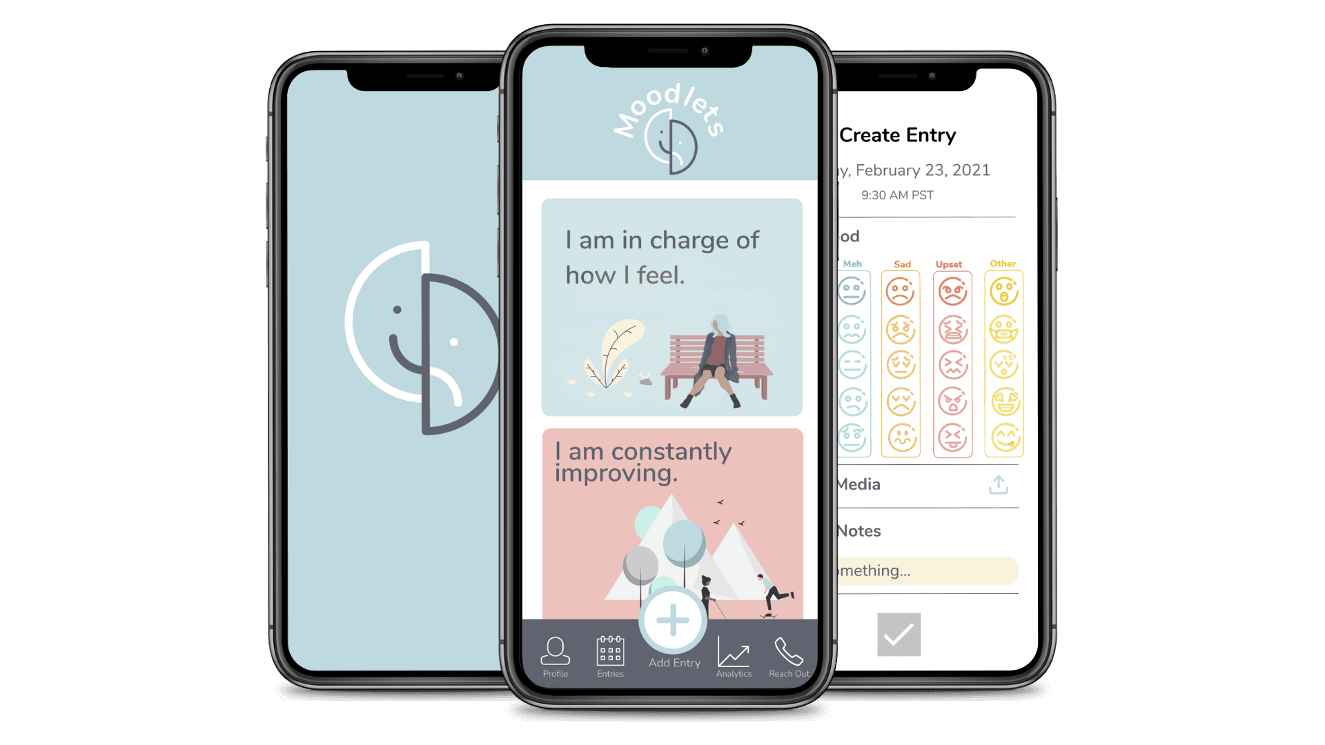
Moodlets: Mobile App that Shows Emotional Patterns & Connects Mental Health Support
A highly functional tool that brings a new level of insight into personal emotional trends and facilitates connections with health professionals.
Read Case Study
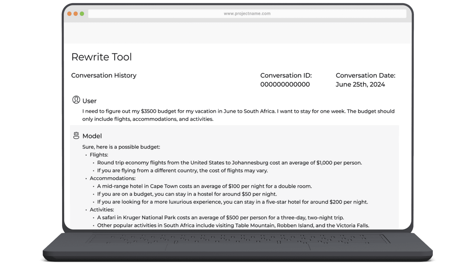
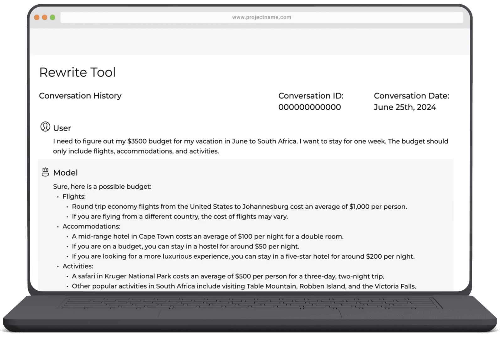
Gen AI LMM Training: Designing Safer, Smarter AI Interactions
Training a Large Language Model with Human-Centered, High-Quality Prompts
Read Case Study
Read Case Study
Gen AI LMM Training: Designing Safer, Smarter AI Interactions
Training a Large Language Model with Human-Centered, High-Quality Prompts
DocuCare: Empowering School Nurses through Better Documentation
A tracking tool born from the vision to not only facilitate but also illuminate the critical work of school nurses.
Read Case Study
NEXT
DocuCare: Empowering School Nurses through Better Documentation
A tracking tool born from the vision to not only facilitate but also illuminate the critical work of school nurses.
Read Case Study
Moodlets: Mobile App that Shows Emotional Patterns & Connects Mental Health Support
A highly functional tool that brings a new level of insight into personal emotional trends and facilitates connections with health professionals.
Read Case Study
Gen AI LMM Training: Designing Safer, Smarter AI Interactions
Training a Large Language Model with Human-Centered, High-Quality Prompts
Read Case Study
Read Case Study
Gen AI LMM Training: Designing Safer, Smarter AI Interactions
Training a Large Language Model with Human-Centered, High-Quality Prompts
DocuCare: Empowering School Nurses through Better Documentation
A tracking tool born from the vision to not only facilitate but also illuminate the critical work of school nurses.
Read Case Study