Designing Moodlets: A Mobile App That Helps Us Understand Emotional Patterns & Connect with Mental Health Support
Designing Moodlets: A Mobile App That Helps Us Understand Emotional Patterns & Connect with Mental Health Support
Overview
Overview
Mental health is often overlooked in the digital tracking world. While we track steps, spending, and calories, few tools support emotional reflection. Moodlets was designed to fill that gap: a mobile app that helps people track moods, understand their emotional trends, and optionally share insights with healthcare professionals.
Mental health is often overlooked in the digital tracking world. While we track steps, spending, and calories, few tools support emotional reflection. Moodlets was designed to fill that gap: a mobile app that helps people track moods, understand their emotional trends, and optionally share insights with healthcare professionals.
My Role
My Role
The objective was to design a mobile-first experience that makes mood tracking feel intuitive, reflective, and shareable — supporting mental health journeys over time. I co-led research, ideation, and design, owned the visual system, conducted usability testing, and guided the prototype into a cohesive and usable product.
The objective was to design a mobile-first experience that makes mood tracking feel intuitive, reflective, and shareable — supporting mental health journeys over time. I co-led research, ideation, and design, owned the visual system, conducted usability testing, and guided the prototype into a cohesive and usable product.
Project Type
Project Type
B2C, Mobile App, Wellness Tech, Emotional Health, 0→1 Product
Team
Team
3 Product Designers (including myself)
Timeline
Timeline
10 weeks, Agile Sprints, Remote
Tools
Tools
Figma, Miro, Adobe Illustrator, Adobe Photoshop, Zoom, StoryboardThat
Client
Client
Personal Project
B2C, Mobile App, Wellness Tech, Emotional Health, 0→1 Product
3 Product Designers (including myself)
Figma, Miro, Adobe Illustrator, Adobe Photoshop, Zoom, StoryboardThat
10 weeks, Agile Sprints, Remote
Personal Project
IMPACT
IMPACT
IMPACT
in task success rate after usability testing
in task success rate after usability testing
40% improvement
40% improvement
40% improvement
enabled for mood reflection: journaling, analytics, and data export
enabled for mood reflection: journaling, analytics, and data export
3 core pathways
3 core pathways
3 core pathways
from users 18–34 seeking emotional clarity and healthcare connection
from users 18–34 seeking emotional clarity and healthcare connection
Positive feedback
Positive feedback
Positive feedback
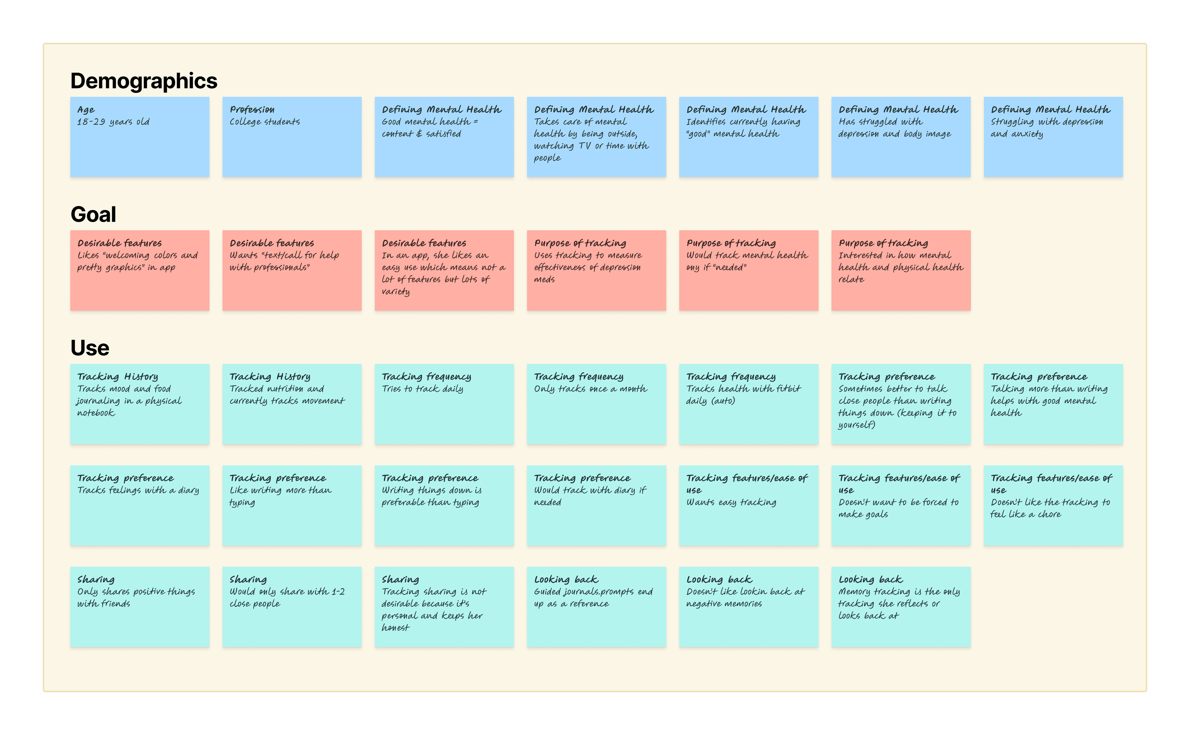
The team and I conducted a competitive analysis of mood-tracking apps and 6 in-depth interviews with users aged 18–34 to identify pain points and uncover design hopportunities. We discovered that while many apps tracked moods, few offered reflection, visual analytics, or healthcare collaboration — key user desires we hadn’t seen fulfilled
The team and I conducted a competitive analysis of mood-tracking apps and 6 in-depth interviews with users aged 18–34 to identify pain points and uncover design hopportunities. We discovered that while many apps tracked moods, few offered reflection, visual analytics, or healthcare collaboration — key user desires we hadn’t seen fulfilled
Explored existing tools and interviewed users to uncover unmet needs in wellness tracking
Explored existing tools and interviewed users to uncover unmet needs in wellness tracking
Key Insights
Key Insights
Users forget to track emotions daily
Users forget to track emotions daily
They dislike revisiting negative memories
They dislike revisiting negative memories
They want “welcoming” visuals and a calming experience
They want “welcoming” visuals and a calming experience
They prefer journaling over tapping
They prefer journaling over tapping
They want the ability to share with trusted people or professionals
They want the ability to share with trusted people or professionals
Synthesized research into personas, journey maps, and storyboards to prioritize features and define user goals
Synthesized research into personas, journey maps, and storyboards to prioritize features and define user goals
Synthesized research into personas, journey maps, and storyboards to prioritize features and define user goals
We built affinity maps, journey maps, and storyboards that visualized how users currently track moods and where our app could provide value. These tools helped us center user emotion, frustration, and aspiration in every interaction. We prioritized moments where reflection, ease, and empathy mattered most.
We built affinity maps, journey maps, and storyboards that visualized how users currently track moods and where our app could provide value. These tools helped us center user emotion, frustration, and aspiration in every interaction. We prioritized moments where reflection, ease, and empathy mattered most.
We built affinity maps, journey maps, and storyboards that visualized how users currently track moods and where our app could provide value. These tools helped us center user emotion, frustration, and aspiration in every interaction. We prioritized moments where reflection, ease, and empathy mattered most.
Affinity Diagraming
Affinity Diagraming
This synthesis helped us represent potential users for our application and to enable us to understand their specific attributes.
This synthesis helped us represent potential users for our application and to enable us to understand their specific attributes.
This synthesis helped us represent potential users for our application and to enable us to understand their specific attributes.
Personas
Personas
Personas
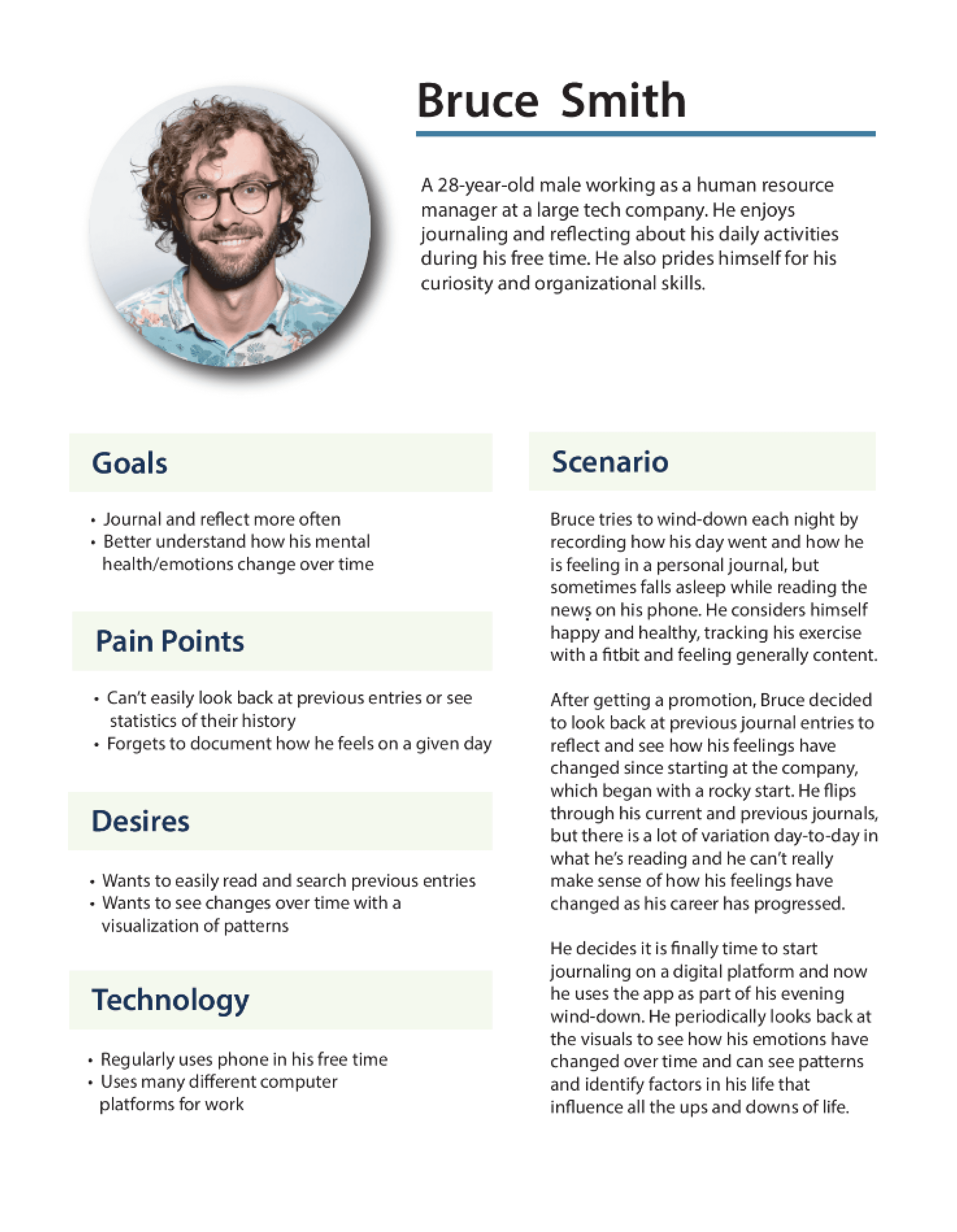
Drawing from our synthesis, we started by creating 2 personas with detailed characteristics and a scenario each would be associated with. Due to the short timeframe of the project, some assumptions have also been made for these personas such as college majors and interests in order to round out their characteristics. We also assumed their proficiency with technology use due to the age, career, and daily routines mentioned in the interviews.
Drawing from our synthesis, we started by creating 2 personas with detailed characteristics and a scenario each would be associated with. Due to the short timeframe of the project, some assumptions have also been made for these personas such as college majors and interests in order to round out their characteristics. We also assumed their proficiency with technology use due to the age, career, and daily routines mentioned in the interviews.
Drawing from our synthesis, we started by creating 2 personas with detailed characteristics and a scenario each would be associated with. Due to the short timeframe of the project, some assumptions have also been made for these personas such as college majors and interests in order to round out their characteristics. We also assumed their proficiency with technology use due to the age, career, and daily routines mentioned in the interviews.
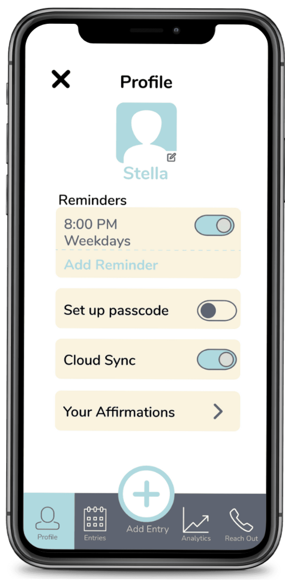
Stella represents someone with mental health challenges who may wish to keep track of her emotions over time for medical purposes.
Bruce represents an individual who wishes to track his feelings out of curiosity.
Stella represents someone with mental health challenges who may wish to keep track of her emotions over time for medical purposes.
Bruce represents an individual who wishes to track his feelings out of curiosity.
Stella represents someone with mental health challenges who may wish to keep track of her emotions over time for medical purposes.
Bruce represents an individual who wishes to track his feelings out of curiosity.
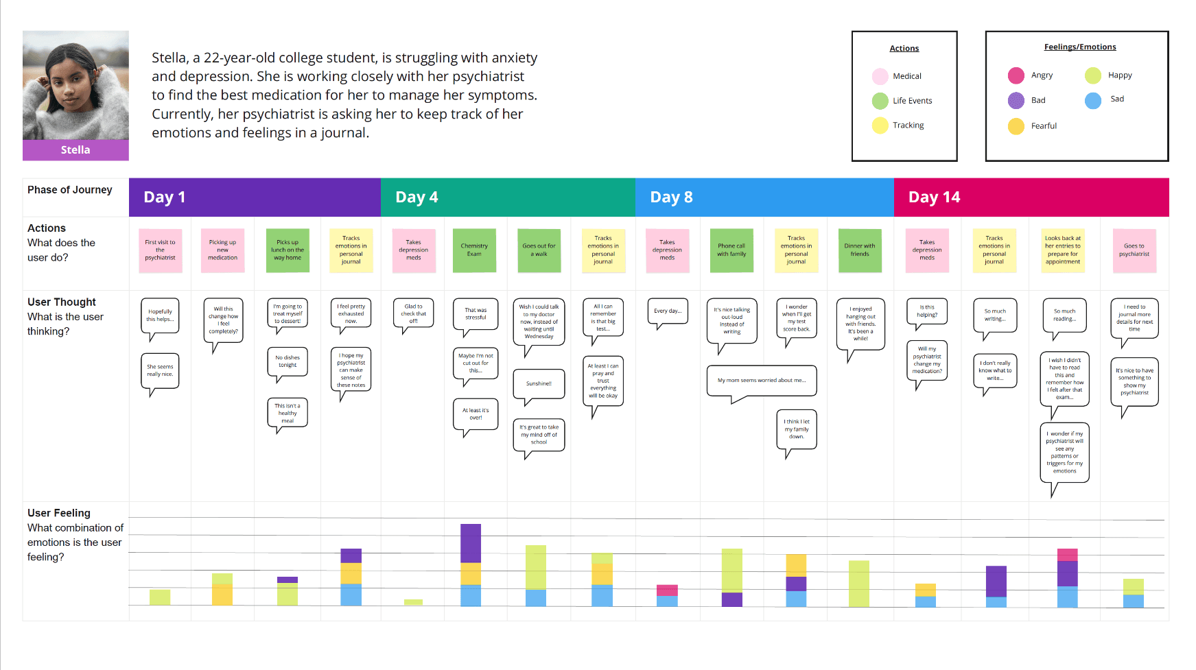
We selected this persona to create a user journey map to capture her current experiences with mental health tracking due to medical concerns.
Stella, who manages anxiety, journals daily and shares notes with her therapist. But her process is disorganized. Moodlets streamlined her daily mood capture and helped visualize patterns over time.
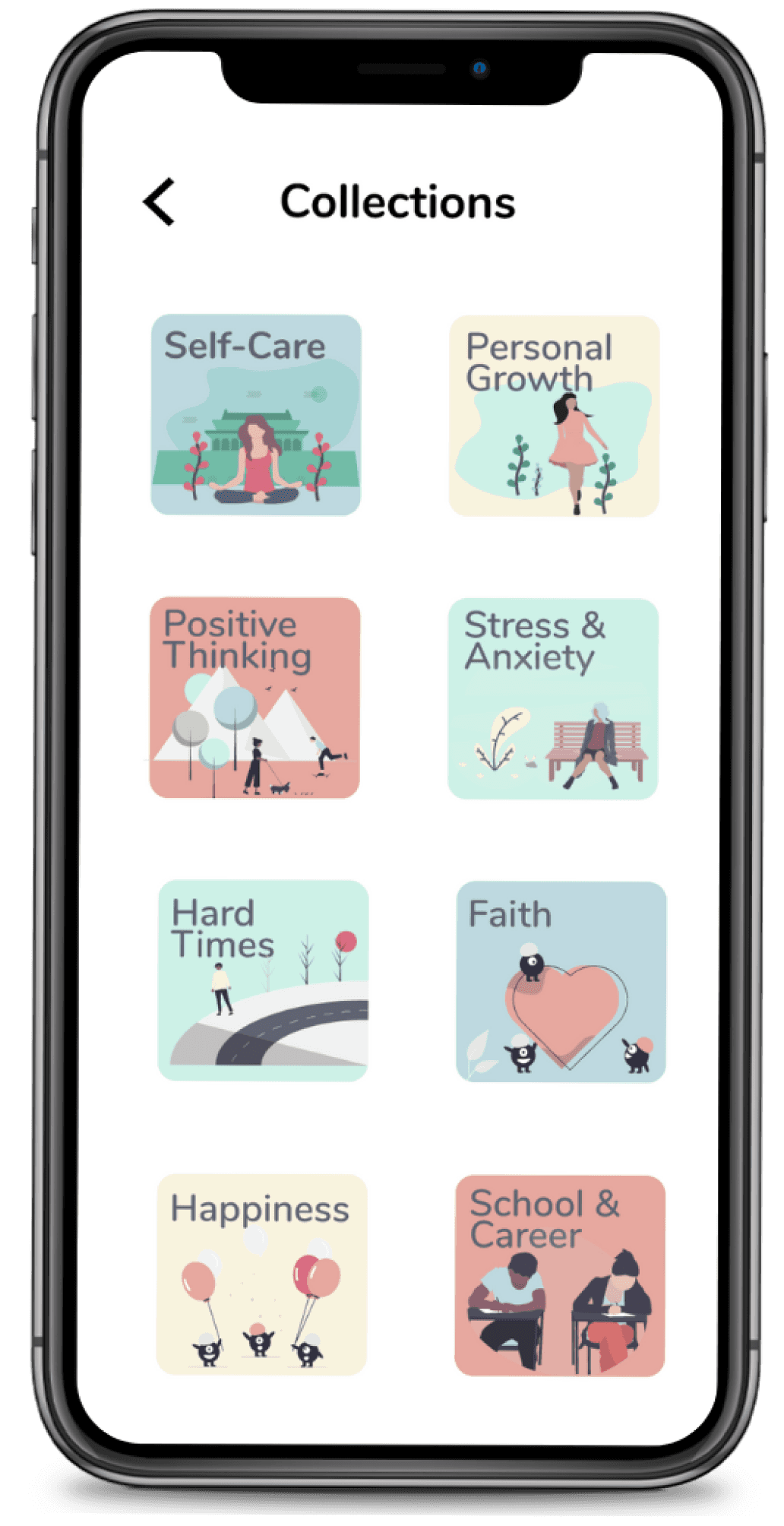
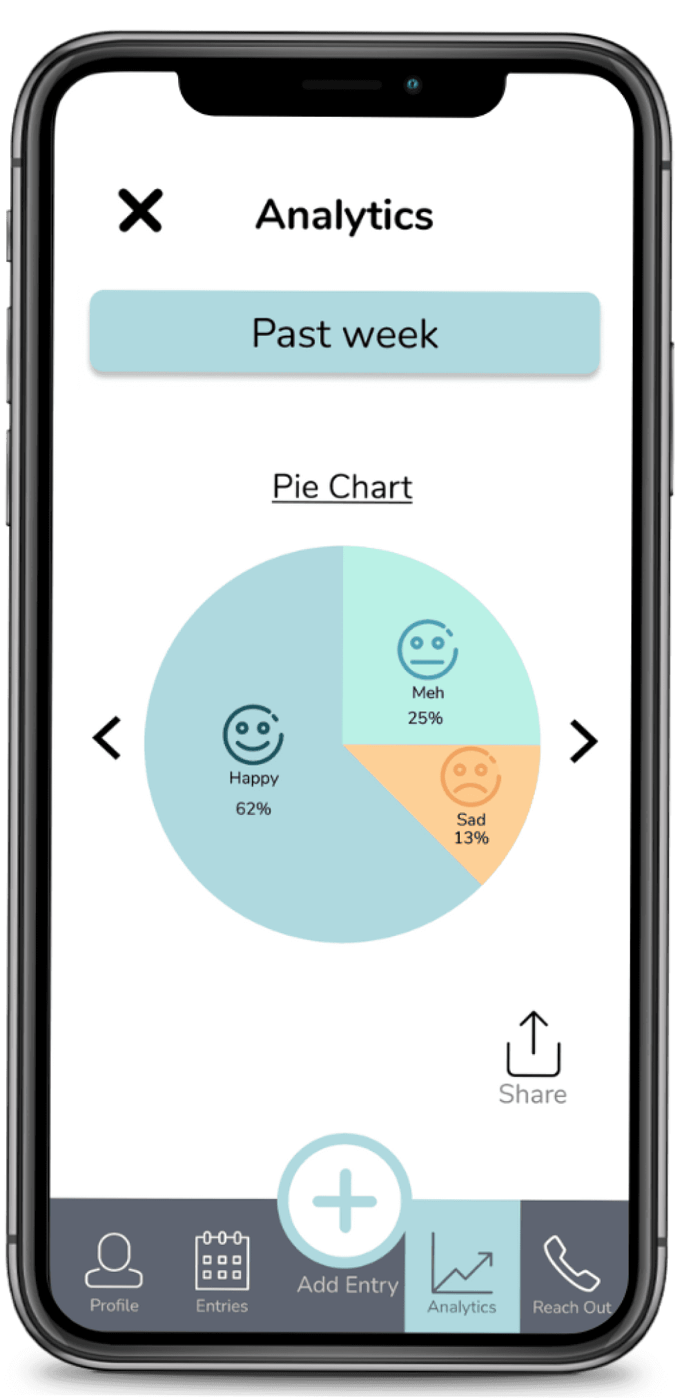
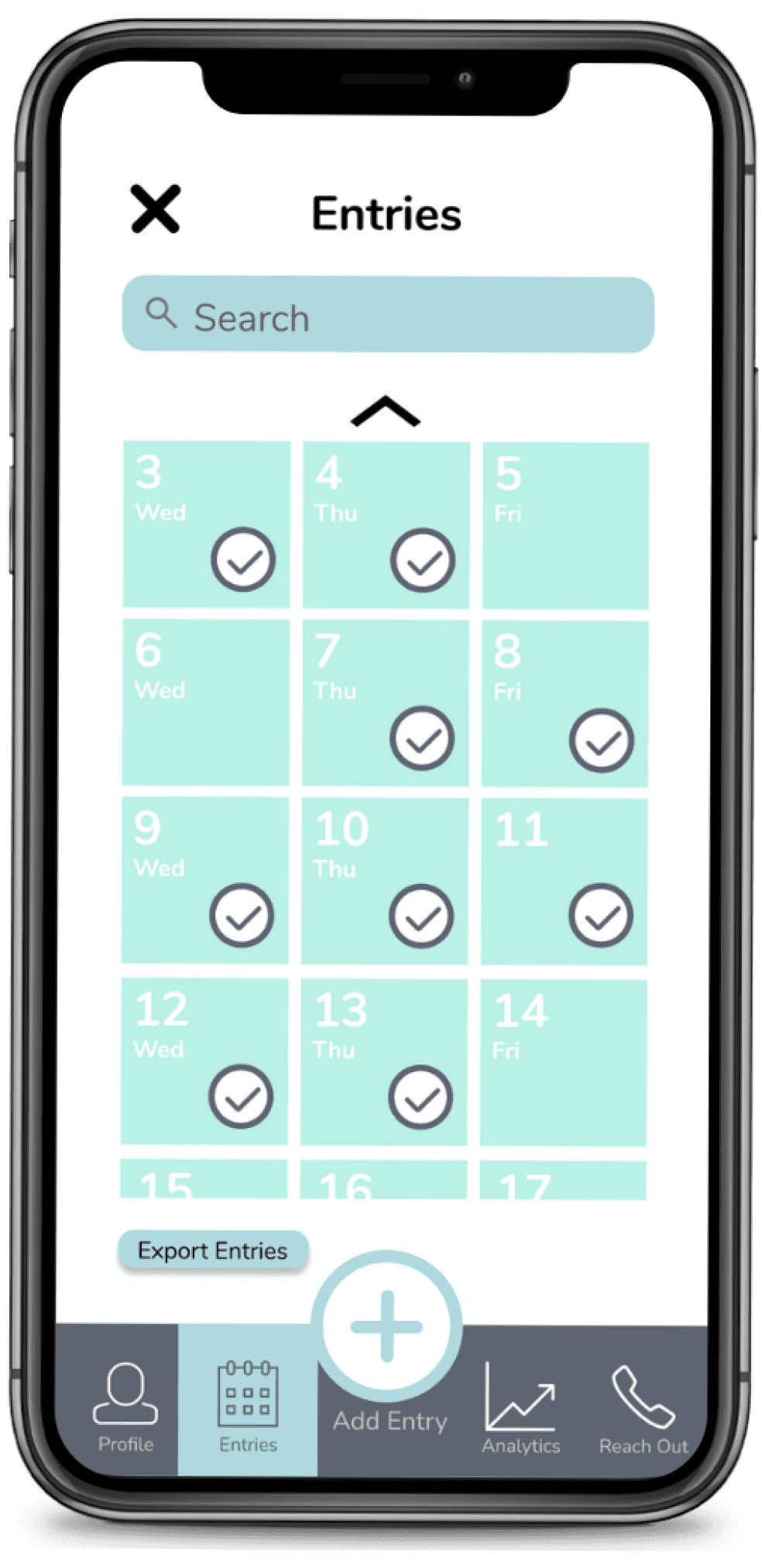
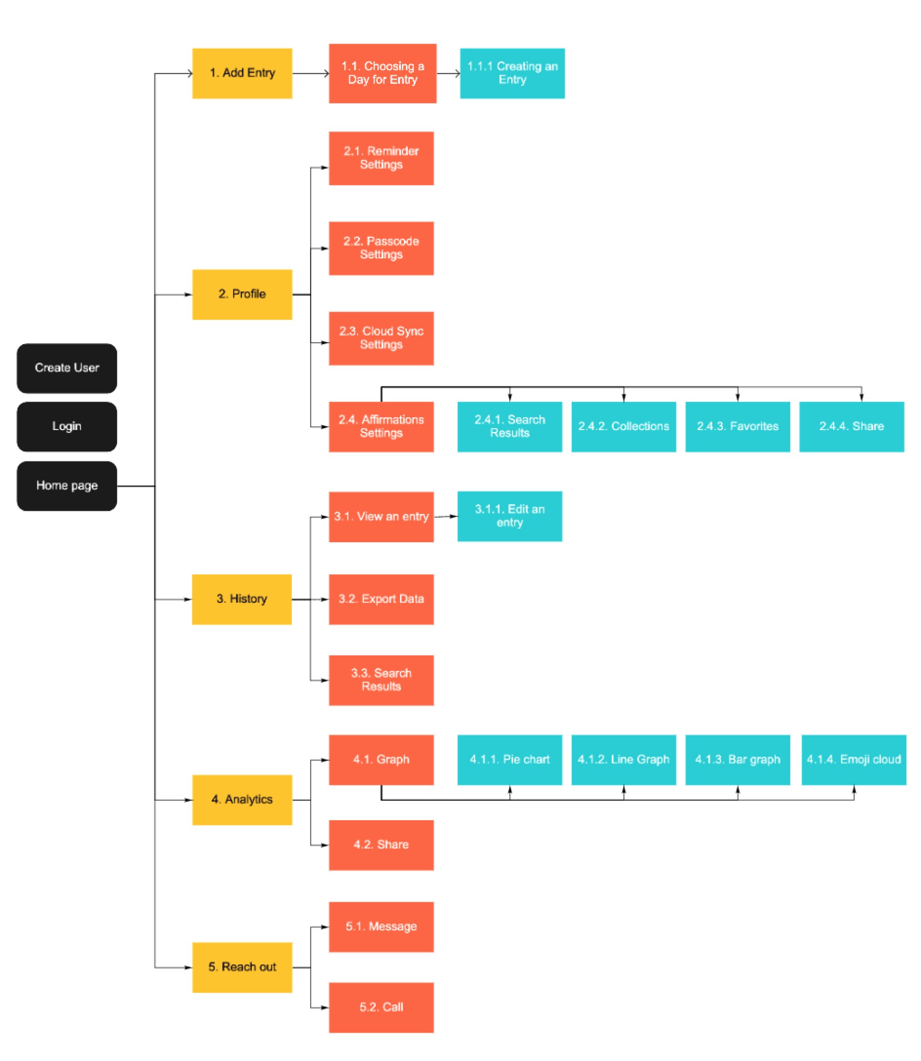
We defined the information architecture and designed three core pathways: mood entry, analytics visualization, and data sharing. Clarity around these use cases helped us scope the MVP and ensure the user could go from reflection to insight to action effortlessly.
We defined the information architecture and designed three core pathways: mood entry, analytics visualization, and data sharing. Clarity around these use cases helped us scope the MVP and ensure the user could go from reflection to insight to action effortlessly.
Translated emotional goals into features by defining the app’s architecture and core interaction flows
Translated emotional goals into features by defining the app’s architecture and core interaction flows
Translated emotional goals into features by defining the app’s architecture and core interaction flows
Key Design Requirements
Key Design Requirements
Core Flows
Core Flows
Lo-Fi Prototype
Lo-Fi Prototype
Information Architecture
Information Architecture
Create an intuitive mood entry process
Create an intuitive mood entry process
Enable reflection through mood analytics
Enable reflection through mood analytics
Facilitate sharing data with health professionals
Facilitate sharing data with health professionals
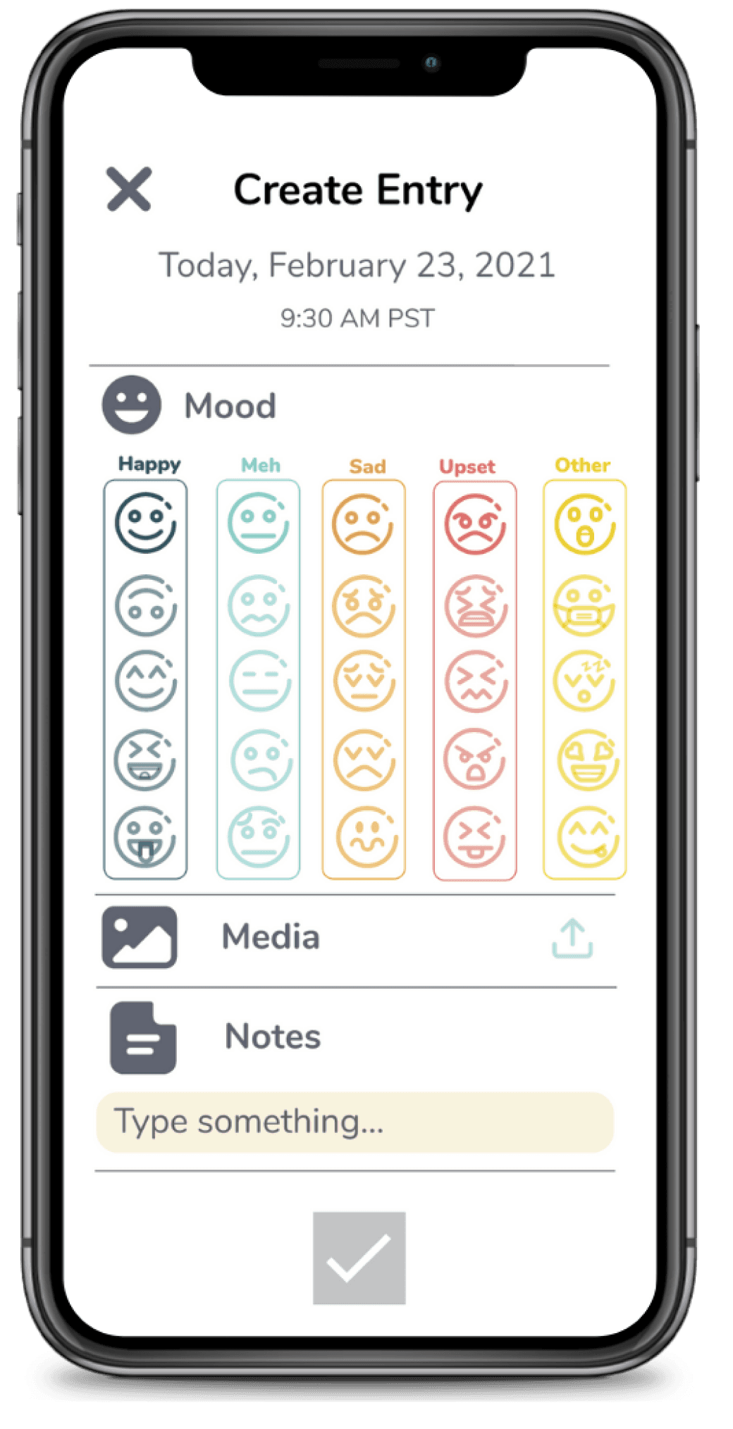
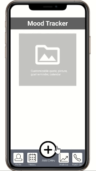
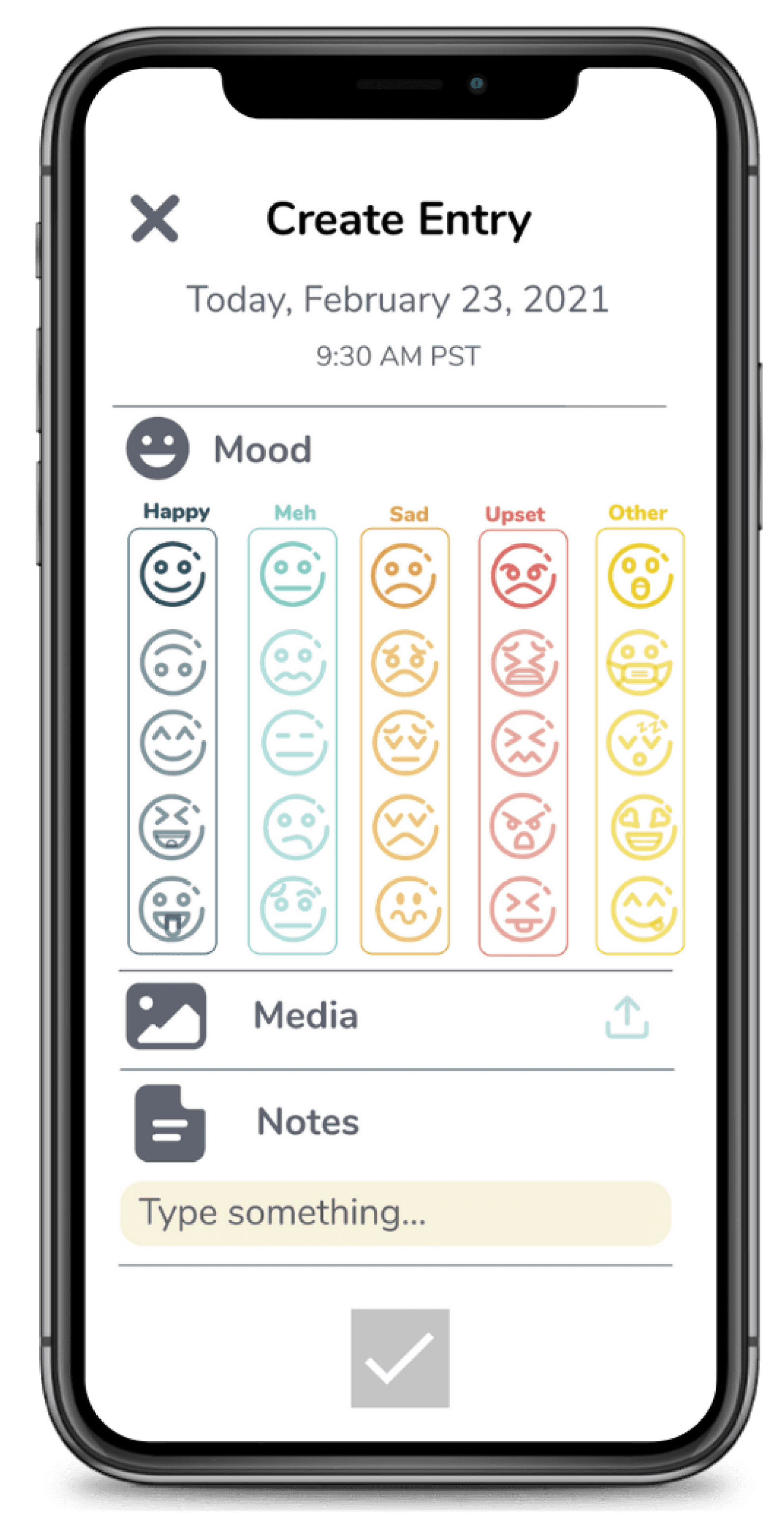
1. Add Entry → Text, emoji, media
1. Add Entry → Text, emoji, media
2. Review Analytics → Filter data
2. Review Analytics → Filter data
3. Share Insights → Export or email graphs
3. Share Insights → Export or email graphs
We ran moderated virtual usability tests with 4 users (18–30 years old) and measured task completion across all 3 flows. We spotted major friction points — from unclear icons to dropdown overload — and made critical changes that improved task success rates by 40%.
We ran moderated virtual usability tests with 4 users (18–30 years old) and measured task completion across all 3 flows. We spotted major friction points — from unclear icons to dropdown overload — and made critical changes that improved task success rates by 40%.
We ran moderated virtual usability tests with 4 users (18–30 years old) and measured task completion across all 3 flows. We spotted major friction points — from unclear icons to dropdown overload — and made critical changes that improved task success rates by 40%.
Tested and iterated on a lo-fi prototype, improving icon clarity and reducing unnecessary interactions
Tested and iterated on a lo-fi prototype, improving icon clarity and reducing unnecessary interactions
Tested and iterated on a lo-fi prototype, improving icon clarity and reducing unnecessary interactions
Major Iterations
Major Iterations
Performance Impact
Performance Impact
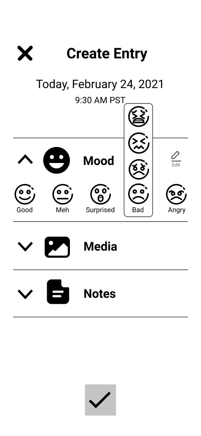
Before
Before
Confusing icons, one-time selections, no cancel button
Confusing icons, one-time selections, no cancel button
After
Color/icon feedback, multi-selection, cancel/back option
After
Color/icon feedback, multi-selection, cancel/back option
After
All options visible at a glance
Users completed tasks more quickly
Users completed tasks more quickly
100% task completion across all flows post-iteration
100% task completion across all flows post-iteration
Before
Before
Nested dropdowns for emotions
Nested dropdowns for emotions
After
All options visible at a glance
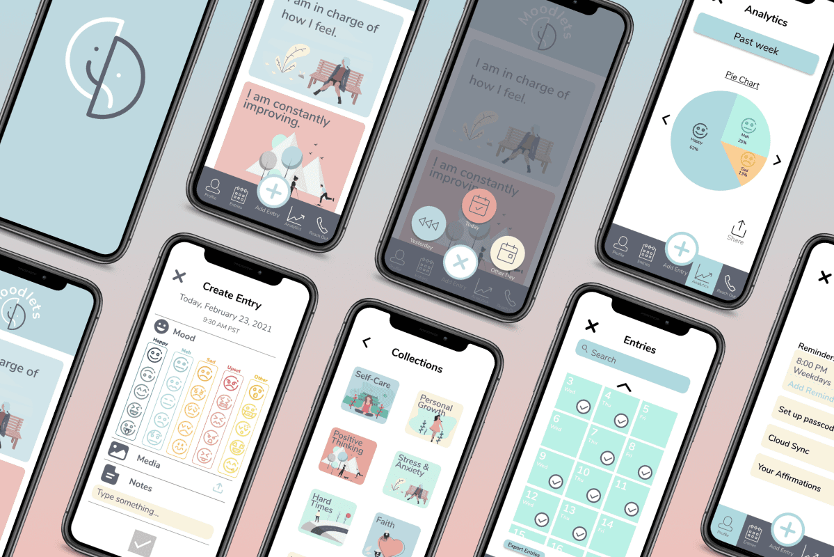
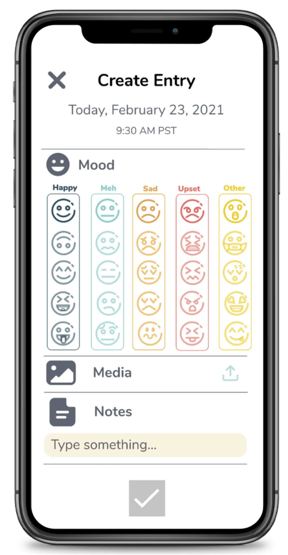
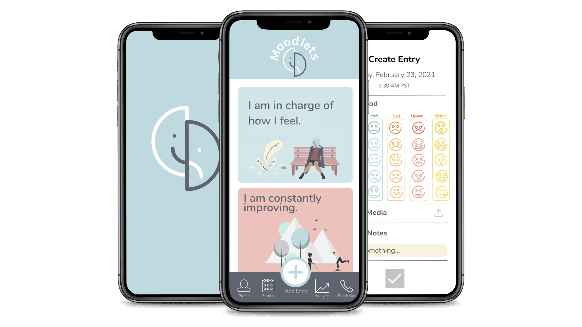
We translated learnings into a clean, modern UI that focused on clarity and warmth — essential for a mental health app.
We translated learnings into a clean, modern UI that focused on clarity and warmth — essential for a mental health app.
We translated learnings into a clean, modern UI that focused on clarity and warmth — essential for a mental health app.
Incorporating feedback from our experience evaluation and wireframes, we translated existing screens and added more for our high-fidelity prototype. This prototype was created in order to showcase the first version of the application in a user's working environment that could be used to expand upon in the future.
Incorporating feedback from our experience evaluation and wireframes, we translated existing screens and added more for our high-fidelity prototype. This prototype was created in order to showcase the first version of the application in a user's working environment that could be used to expand upon in the future.
Finalized a high-fidelity prototype with calming visuals and emotion-centered interactions
Finalized a high-fidelity prototype with calming visuals and emotion-centered interactions
Finalized a high-fidelity prototype with calming visuals and emotion-centered interactions

Calming color palette to reduce overwhelm and coordinate well to each other throughout the app design and illustrations
Nunito
Heading 1
Heading 2
Paragraph 1
Paragraph 2
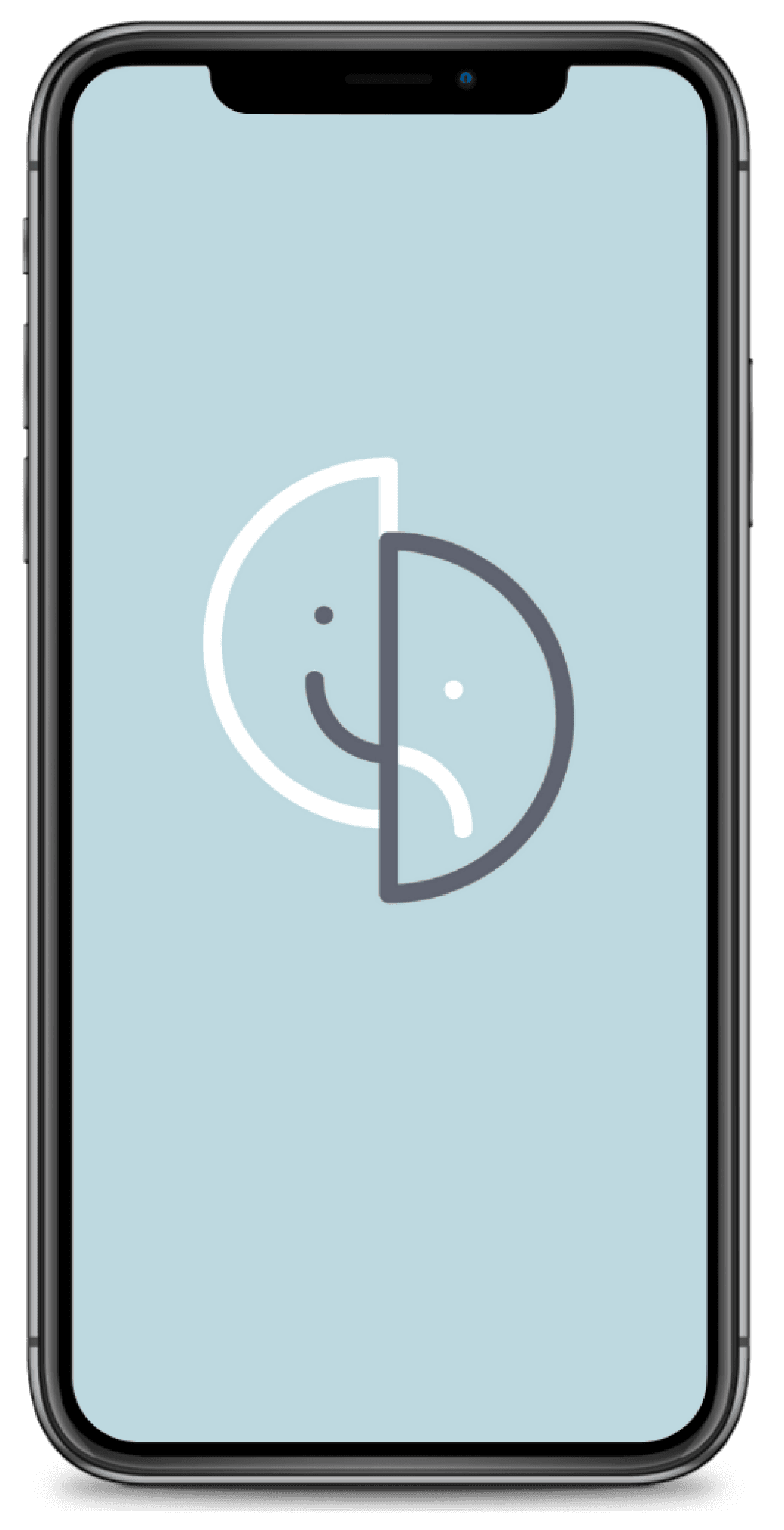
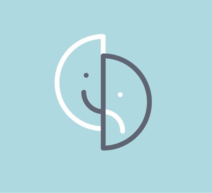
Custom logo evoking connected emotions and their relation to one another, incorporates the color palette, can be read on many different backgrounds. Inspired from the app name from the word "droplets" to represent the use of little emojis when tracking moods
Sans serif typeface to reflect an approachable, friendly, modern, and clean aesthetic
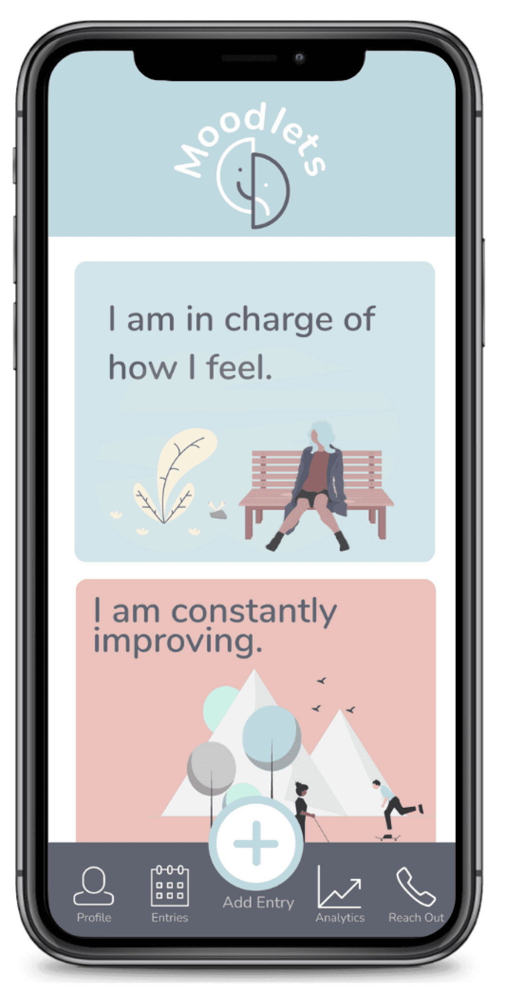
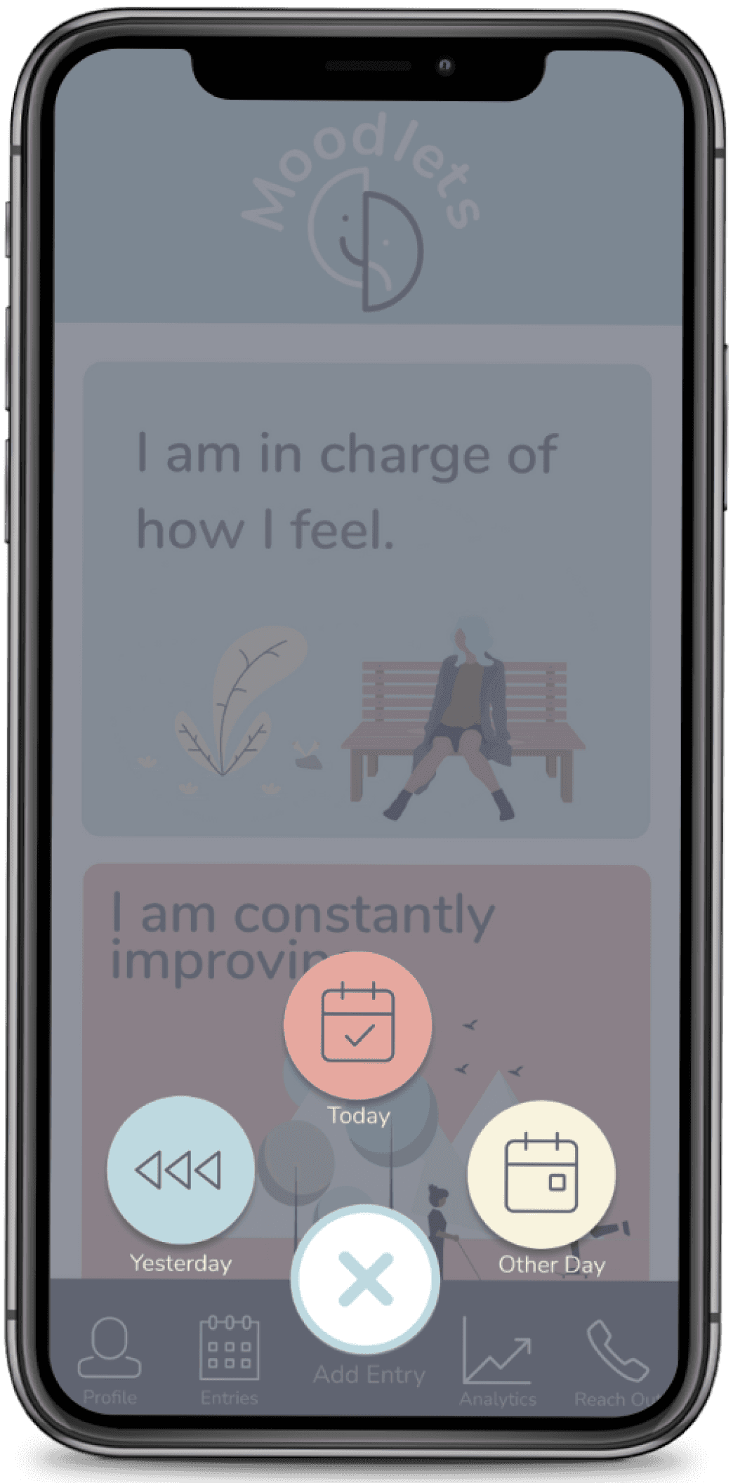
I am in charge of how I feel.

I am constantly improving.
I am a wonderful leader.
Happy
Sad
Upset
Meh
Other
Happy
Meh
Sad
Upset
Other
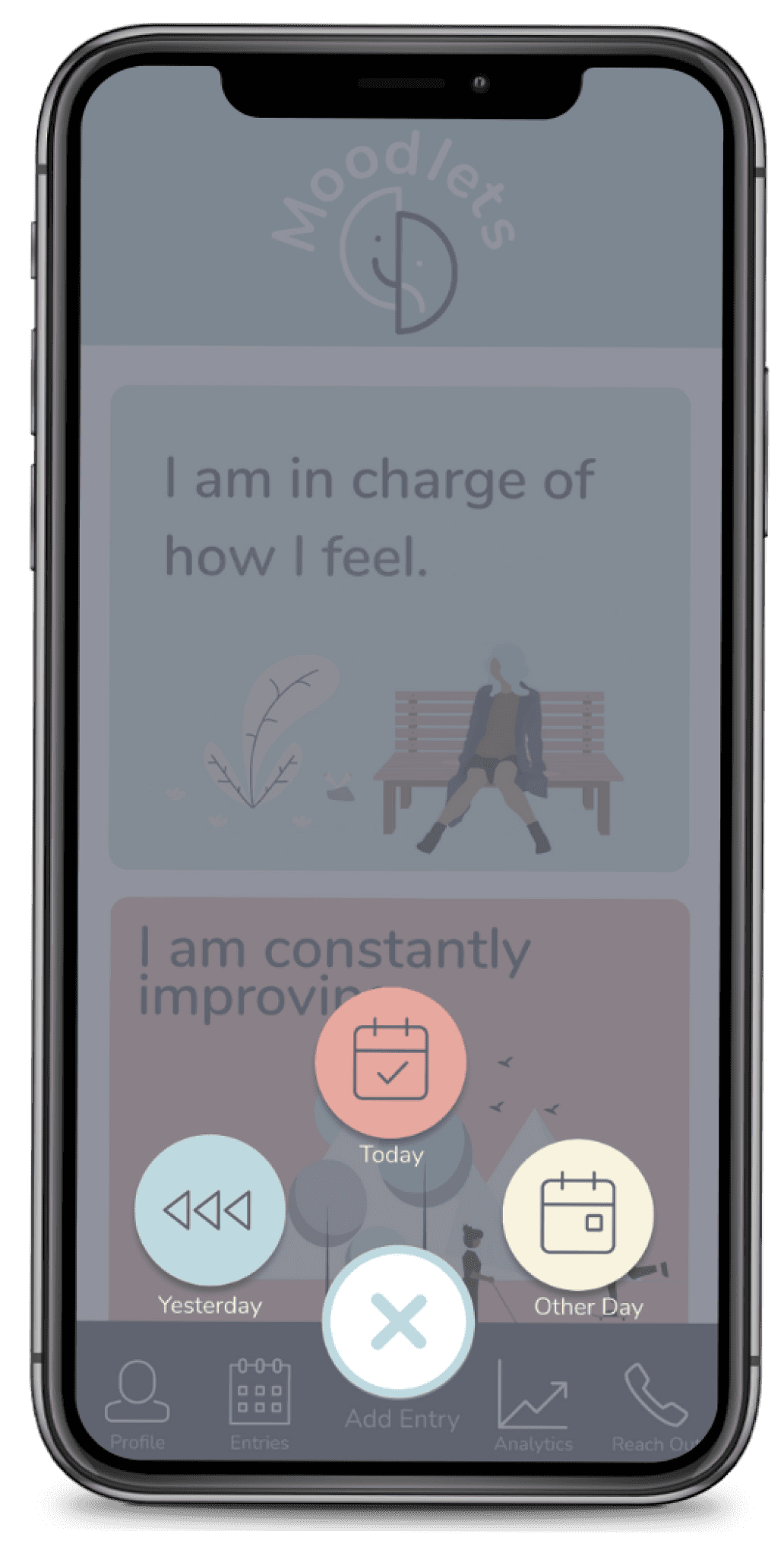
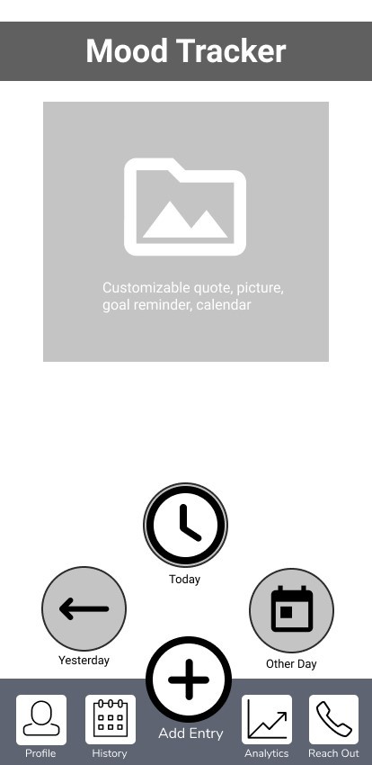
Today
Yesterday
Other Day
Iconography, emojis, and illustrations to support emotional nuance
Final Prototype
Final Prototype
Final Prototype
Main Features
Main Features
Visual Design Choices
Visual Design Choices
Calming color palette to reduce overwhelm and coordinate well to each other throughout the app design and illustrations
Calming color palette to reduce overwhelm and coordinate well to each other throughout the app design and illustrations
Sans serif typeface to reflect an approachable, friendly, modern, and clean aesthetic
Sans serif typeface to reflect an approachable, friendly, modern, and clean aesthetic
Iconography, emojis, and illustrations to support emotional nuance
Custom logo evoking connected emotions and their relation to one another, incorporates the color palette, can be read on many different backgrounds. Inspired from the app name from the word "droplets" to represent the use of little emojis when tracking moods
Nunito
Heading 1
Heading 2
Paragraph 1
Paragraph 2
I am in charge of how I feel.
I am constantly improving.
I am a wonderful leader.
Today
Yesterday
Other Day
Happy
Sad
Upset
Meh
Other
Happy
Meh
Sad
Upset
Other
Iconography, emojis, and illustrations to support emotional nuance
Add/Update mood entries with text, emoji, or media
Add/Update mood entries with text, emoji, or media
Reflect through visual analytics
Reflect through visual analytics
Share insights via email
Share insights via email
Contact professionals in emergencies
Contact professionals in emergencies
Reflecting back:I learned how to design for emotional sensitivity and remote collaboration under time constraints
Reflecting back:I learned how to design for emotional sensitivity and remote collaboration under time constraints
• Designing for mental health means creating space for emotional safety
• Users value visual feedback and calm design more than feature overload
• Testing early helped us pivot fast and design smarter
• Designing for mental health means creating space for emotional safety
• Users value visual feedback and calm design more than feature overload
• Testing early helped us pivot fast and design smarter
• I’d revisit how shared reports could meaningfully help healthcare providers and test data interpretation with real practitioners.
• I’d build reminder flows to encourage daily check-ins without guilt
• I’d revisit how shared reports could meaningfully help healthcare providers and test data interpretation with real practitioners.
• I’d build reminder flows to encourage daily check-ins without guilt
What I Learned
What I Learned
• Remote tools like Figma and Miro require systems to stay aligned
• Communication was key — I introduced file management practices that kept us in sync asynchronously
• Remote tools like Figma and Miro require systems to stay aligned
• Communication was key — I introduced file management practices that kept us in sync asynchronously
Takeaways
Takeaways
If I Could Continue…
If I Could Continue…
NEXT
NEXT
Moodlets: Mobile App that Shows Emotional Patterns & Connects Mental Health Support
A highly functional tool that brings a new level of insight into personal emotional trends and facilitates connections with health professionals.
Read Case Study

DocuCare: Empowering School Nurses through Better Documentation
A tracking tool born from the vision to not only facilitate but also illuminate the critical work of school nurses.
Read Case Study
NEXT
DocuCare: Empowering School Nurses through Better Documentation
A tracking tool born from the vision to not only facilitate but also illuminate the critical work of school nurses.
Read Case Study
Moodlets: Mobile App that Shows Emotional Patterns & Connects Mental Health Support
A highly functional tool that brings a new level of insight into personal emotional trends and facilitates connections with health professionals.
Read Case Study
Gen AI LMM Training: Designing Safer, Smarter AI Interactions
Training a Large Language Model with Human-Centered, High-Quality Prompts
Read Case Study
Read Case Study
ReWA: A Visual Strategy to Promote Family & Community Empowerment
A modern, cohesive, and impactful visual identity that authentically reflects the mission of Refugee Women's Alliance—supporting refugee and immigrant women and their families.

Read Case Study
B2B Cloud Commerce Design System: Redesigning a Experience
A redesign of a design system for a site with over a 1,000 products, 4 acquisitioned companies, 62 countries, 25 languages, AA ADA compliance, AEM Cloud.

DocuCare: Empowering School Nurses through Better Documentation
A tracking tool born from the vision to not only facilitate but also illuminate the critical work of school nurses.
Read Case Study
Read Case Study
ReWA: A Visual Strategy to Promote Family & Community Empowerment
A modern, cohesive, and impactful visual identity that authentically reflects the mission of Refugee Women's Alliance—supporting refugee and immigrant women and their families.